Be yourself; Everyone else is already taken.
— Oscar Wilde.
This is the first post on my new blog. I’m just getting this new blog going, so stay tuned for more. Subscribe below to get notified when I post new updates.
Be yourself; Everyone else is already taken.
— Oscar Wilde.
This is the first post on my new blog. I’m just getting this new blog going, so stay tuned for more. Subscribe below to get notified when I post new updates.
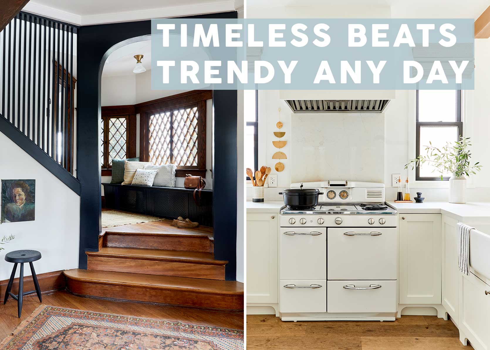
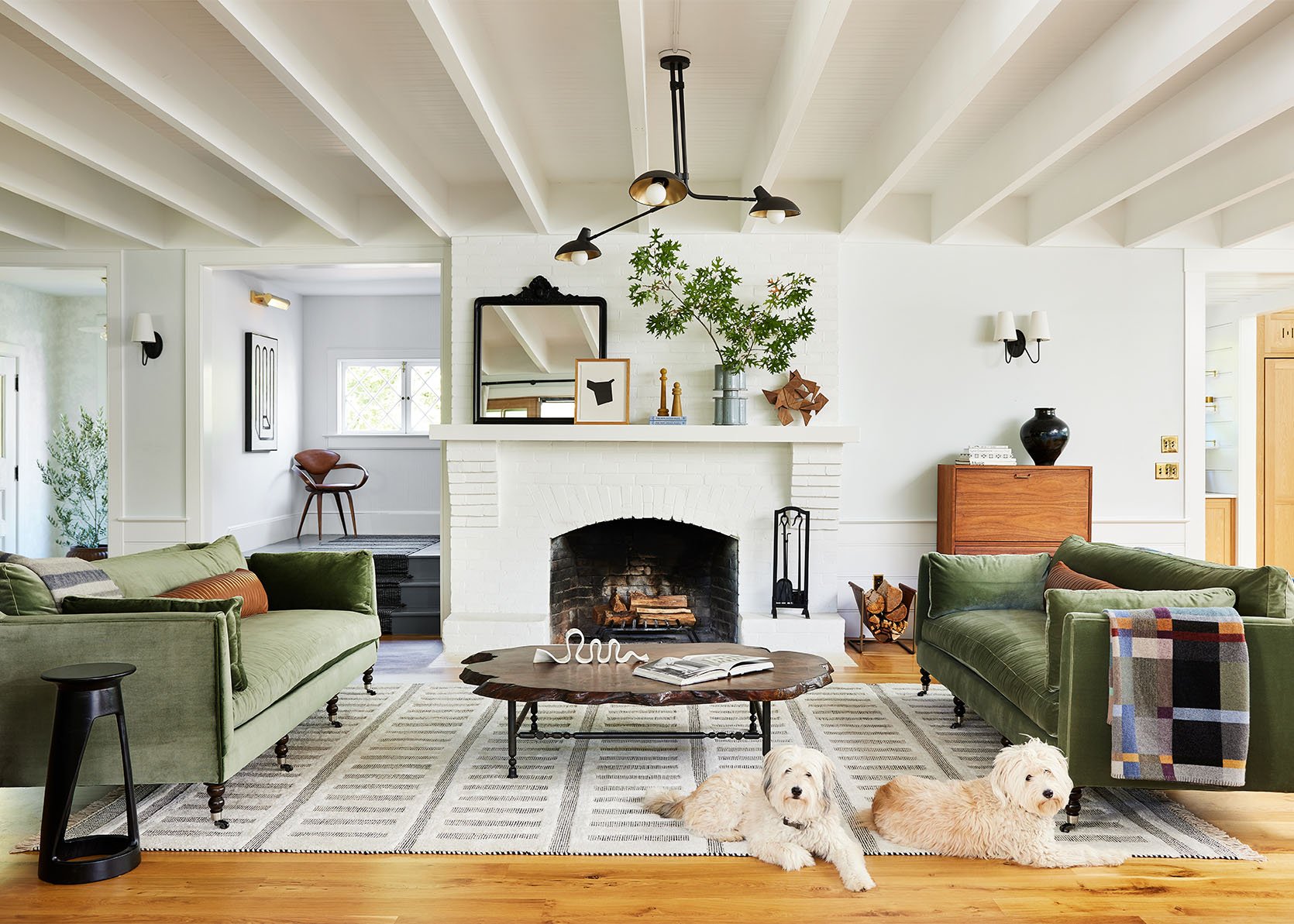
We do a lot of talking about trends around here. Heck, it’s the nature of design writers to do so. Always looking forward, exploring exciting concepts to come. Plus, there’s a bit of an ego component of being able to “call” what’s next and then be right about it. But something I don’t think we focus on enough is the steadfast things in design and decorating. What product and material choices can you make for your home that will still look good five, 10, even 50 years from now?
That’s exactly what some of you asked me to think through earlier this month in the comment section of a post I wrote about on the opposite topic matter—2025 trends that have run their course. Honestly, I’m so glad this was requested, because it gave me pause enough to think about it. Thanks in large part to social media, we have an embarrassment of riches of visual resources to work from now, but what comes from that, at least for me, is a kind of style ennui.
We all move through looks, vibes, and trends so quickly, at least in our minds and conversations, that it’s so important to remember that our homes don’t have to flip-flop all that much in response. Pick up some fun little trendy lamp or add in some butter yellow or red? Sure! Why not, have fun. But if you want to lay the foundation for lasting design, there are 10 things I’m calling out as timeless (spoiler alert: one of my timeless picks also happened to be on my 2025 tired trends post, so…keep reading to read my thoughts on what and why).
But first, let’s talk about what timeless in design really means. Sure, time-less means time doesn’t affect the appeal of something, but what I found again and again is that the things that last visually speaking are also the things that last, physically speaking. Quality and craftsmanship are always going to reign supreme, and cheapy, synthetic things just simply won’t. Gorgeous real wood paneling and trimwork? Timeless. Vinyl or particle board “wood-look” floors or wall treatments? They likely will date as fast as that peach in your fruit bowl goes soft next to a bundle of bananas.
It’s easy to look at a timeless room (or at least a room with timeless elements), and know down in your veins that it’s something you could have happily lived in 100 years ago, or 75 years from now. Trend-forward rooms can be exciting, fun and funky, but I can feel a sense immediately that it’s of the moment and fleeting. Also of note is the fact that something that is classic may become trendy and then fall out of trend, but it’ll always look good because it works for a reason. White kitchens may have been all the rage over the last 10-15 years, but they have since been dwindling in popularity. Guess what, though? White kitchens are timeless, and as long as the elements in said kitchen are not overly modern *and* it’s made of quality materials, it’ll look good for decades.
To me, timeless design is simple, functional and familiar, the latter bringing up a thought I had that classic/traditional/timeless varies on your background. What is classic in this country and to our culture is likely quite different than in a different part of the world, especially if European colonists didn’t influence their architecture. In doing research for this post, I tried to find some information about why our tastes change over time, and found this interesting passage about our perception of art:
The Role of Cultural and Social Factors in Shaping Taste: Cultural and social factors significantly influence an individual’s visual taste. Cultural background provides a lens through which people view and interpret art, with different cultures valuing different aesthetic qualities. For instance, the appreciation of minimalism in Japanese art versus the grandeur of Baroque architecture in Europe illustrates how cultural context shapes visual taste. Social factors, including education, socioeconomic status, and exposure to different art forms, also play a crucial role. For example, individuals with a higher level of art education may appreciate more abstract or conceptual art, whereas those with less exposure might prefer more representational works.
Anyhow, I can nerd out on the whys behind this topic all day, but it’s time to go down our list of timeless picks (at least from my perspective), in no particular order:
Above and beyond, natural materials of quality such as wood, stone and marble are some of the most trend-proof things in our homes and buildings, specifically by not being too showy in terms of color or finish. They tend to age beautifully and are durable or, at the very least, flexible in ways that artificial materials can never aspire to be.
Natural wood in common mid-tone finishes have a way of always working aesthetically. They mix well with other trendier wood tones when they happen to pop up (remember the espresso wood stain craze of the early aughts, and of course, we still haven’t shaken the blonde wood and white oak everything from the Scandi movement), and don’t feel particularly glued to an era in particular. Cerused woods, grey-finished woods, and anything overly lacquered, for instance, do not fall into this category, in my opinion. Those are tied to a time and place.
While wood paneling is closely related to the ’70s for many people, there were a lot of awful, man-made wood-look treatments, whereas a solid wood paneling installation like the above is going to work with furniture of all types, trends, and styles for a very long time and not be triggering down the line.
I told my friends the other day that when I run for office (which I often threaten, sometimes as Mayor sometimes President depending on the mood/problems I want to solve and usually after a couple glasses of wine) my #1 goal will be to pass a new national holiday for parents – an “organize your house and life day off” at the beginning of the school year and another one right after the holidays in early January. The kids will go to school, and grandparents will step in as substitute teachers so the teachers who are parents can also take the day off. It would 100% benefit the country writ large. I know I’d be a better leader if my house and schedule were fully organized. Could we do this organizing on a weekend? Maybe! But we want to actually spend a nice time together as a family on the few summer weekends we get!! And then fall sports slam you in the face so fast that your weekends get gobbled up, driving kids all over town. Oh, and that’s another thing, I will also run on the “No sports on Sundays” platform. Being raised Mormon, you just had church and family day on Sundays, and dare I say I think it’s what we need as a society (church or no church, just a rest day to reset, connect, and ready yourself and your house for the week). When did Sundays become such a kids’ sports day????? I was talking to Sean Lowe about how it is in Texas, assuming it was held more sacred there since church is more widely attended, and he said, “nope, so many football and cheer practices,” because sports are such a thing there. Do we need to move to Utah!!?? It’s just out of control at such young ages, IMHO. Last spring, we were spending 4 hours on a field on Sundays (plus the 1/2 hour commute) and then had tumbling practice in the afternoon on the opposite side of town. This fall, we made the kids choose between sports, which is a bummer for them, opting for family time instead (they have mixed feelings). I’m down for weeknight practices, our kids love structure and anything to keep them from asking for screens (especially as the days grow shorter and darker). But give us our weekends back!! A game or two at the local school? FINE.
Anyway, in an attempt to assert my will, I closed down the office last Friday and today for a four-day weekend for myself and the team. We went camping over the weekend, and I’m using today to go through all their closets (with them, as school hasn’t started yet) and purge and organize their new clothes. School starts tomorrow, so we’ll meal prep this afternoon, which always makes me feel like a “good mom,” lol. Let me know if you want a “what we meal prep and why” post. I’m not an expert, but I have dialed it in (and I listen to podcasts or audiobooks while doing it, which keeps me entertained and feels like good “me” time). It usually takes 3 hours, but I really do enjoy it (the kids might “help”).
So no real blog post today – the one we had planned that Jess prepped for me to write fell through my cracks, and that’s ok. I find the end of August so challenging – we aren’t done with summer (Labor Day is next weekend!) and yet we are forced to put on our fall brains. Most moms I know are very discombobulated and feel all out of sorts. You want to enjoy the last weeks of the long days, but then you look at your family calendar, and it’s just too much. Oh, I want to push back about the whole “let your kids be bored” thing. We all want to do that, of course, but the screens these days are so addictive and tempting that it’s just so much easier to have organized sports or after-school activities than deal with them asking for them (even though we have clear boundaries and they know when they can/can’t have them). We do a ton of scheduled weekly playdates. My mom, who is helping to raise my nephews, agreed that screens (specifically video games) have made parenting so much harder, so much more of a battle, than when she was raising her 6 kids in the 80s and 90s (just go outside!). That made me feel better. Our kids don’t have phones or anything (we are adhering to Jonathan Haidt’s four rules for screens), but between the video games and the ultra-processed food everywhere, I feel like we are constantly battling these really addictive things that are just so normalized. Or maybe I listen to too many podcasts? Maybe…
That’s all to say, hang in there, moms/parents. I’m obviously spoiled that I control my company and can give extra days off to myself and my team (which always makes me feel better – to not be the only one to benefit), so I hope you all have some time for yourself. Use one of those mental health PTO days if your company gives them – that’s what they are for. Brian is the lead parent and does 50/50 house/parent work here, so I can’t complain, and yet we both feel a bit stretched. I know that it’s just that we haven’t settled into the fall routine yet and have too many fun social engagements, which will be reduced soon. And “SOUP-tember” is right around the corner (which is code for yes, a lot of soups, but mostly just a healthy structured routine of school/work, exercise, going to bed early, staying in at night, cooking and romance novels 🙂 If you haven’t binged Modern Family or The Good Place with your kids yet it’s a fantastic time to start. We have nightly TV family time from 7-8 pm and need a new show that we’ll all enjoy, because those two have kept us entertained for the last year. Any suggestions for 10 and 12-year-olds?
Happy back to school to all those parents, and thanks to all those who support us 🙂
Opening Image Credit: Photo by Kailtin Green
Happy Sunday, everyone! We know that this past week was the last week of summer for most people with kids. We’re sure it’s a little bittersweet:) On the EHD front, we are gearing up for a VERY exciting September, so feel free to get excited about that! Until then, let’s get to these links.
This week’s house tour was designed by Yond Interiors. If you haven’t checked them out, go now! Their style is warm, layered, and always special. This home, though, is a Victorian house in San Francisco. As you can imagine, it’s stunning. The office with interior windows might be our favorite detail…what’s yours?!
From Emily: Fall Boots and a movie. No, I’m not just going to link up the family comedy of the summer, Freakier Friday (appeases all three generations, but it’s soooo silly), but I want to – I lol’d like 7 times. I will however mention that my favorite boots of last year are back in stock, the ones that I reached for every day because they were so comfortable (Korkease, FTW) and looked good with all pants + had a chunky heel (which sure is nice especially when you are wearing “the big pant” – i.e. baggy pants). I’ve never been so mad at Buttercup (our dog) for eating a shoe as I was last March (and they were sold out, so I couldn’t replace them!!). ANYWAY, they are super simple and not crazy design forward, but they were just SO comfortable (soft and cushy inside, the perfect arch for my arch, and the patina of the leather wore so well in the rain even). I hate rebuying something that you just bought, but it is a testament to its goodness (also, don’t neglect walking your dogs). I got the brown ones, and yes, they are true to size.
From Gretchen: I’m heading to Toronto to visit some friends, and there’s nothing like an upcoming International trip to awaken the shopping bug inside of me. And let me tell you, that parasite did some damage. While I actually found a bunch of great new (to me) pieces at an estate sale, I also hit up Anthropologie to really round out my week away wardrobe with a few fancier items. My favorite thing I scored? These incredible plaid ruffled pants in a size 30 fit like a glove and have a nice amount of stretch to the fabric. The pattern on these pants is pretty fun, but the fact that it’s a brown plaid makes it easy/simple enough to wear with a lot of tops in my closet. Plus, they are just super comfortable and a nice lightweight for summer. And those ruffled bottoms? So cute. I’m also just now seeing they also have them in leopard online?? I might need to add to cart…
GREAT NEWS! Since Labor Day is upon us, that means our new sofa and chair collection, Room Service by Emily Henderson, is on sale, like right now:) We are incredibly proud of these pieces and hope that if you are in the market for beautiful and comfortable seating, you’ll take a look. Here’s a blog post where Em talks about each one!
From Marlee: In case you’ve never tried one of these, let me introduce you to the most incredible, mindless, relaxing activity I have ever tried. These gem by number kits are the BEST – think paint by number, but much more tactile and satisfying. It’s the best secondary activity to keep your hands busy while watching TV (that’s not sitting on your phone), or the perfect thing to do while listening to a podcast or audiobook. It’s one of those activities that I overlooked for so long because they’re usually marketed for kids. DON’T let that stop you – we should all be trying to infuse more whimsy and low-stakes fun into our lives… these are easy and impossible to mess up. My favorites are these mini kits – they’re less of a commitment and much cuter than some of the super intense ones (if you search gem painting online, you’ll see what I mean, there’s some crazy ones out there), and you get a bunch of different ones in the same kit. Small disclaimer: you do need ample light, so make sure you have a little lamp if you’re doing it at night, and these are not great around small children because there are very small pieces (and spilling would be a nightmare). Definitely bookmark these for the holiday season because they make great gifts, but until then, why not give one a whirl yourself:)
From Arlyn: You know when you wrap up the loose ends of all the shows you’re currently watching, and then you’re left with nothing? It can be so hard for me to commit to a new show—new people, new story lines, new universe, possibly with its own set of rules. But on a whim, I threw on Your Friends & Neighbors on Apple TV+ (which almost never misses) with Jon Hamm, whom I like, and it was a very fun, easy-to-get-into show both my husband and I enjoyed. It’s set in a wealthy enclave that I’m assuming is modeled off of Westchester County in New York, so the houses give a lot of eye candy, too! We finished the first 10-episode season in three days, which means one thing: I’m back to square one, but looking forward to a second season of this one.
From Mallory: It’s been over 3 years, and I still reach for these workout shoes every day. In fact, I love them so much I have two pairs, so I can still wear them while they’re drying after I’ve washed them (you can just chuck them in the washing machine). They’re lightweight and laceless (which I love because I just can’t be bothered with laces anymore). I truly LOVE being able to slip these on and run out to the gym with so much ease – they were also voted the best airport/traveling shoe for a few years in a row. FYI, I love my Hokas for running, but for strength training, these are my go-tos since you need to wear a flatter shoe. They’ve lasted me for so long, so they’re worth the price in my opinion, and they come in so many fun colors too!!
From Jess: Your girl is falling apart at the seams! Mostly kidding, but I’ve been needing to ice up with some minor pain flare-ups. My back is area number one, so I went pretty all out and got this large ice pack for shoulders and back with straps. The straps are what sold me, so I can sit, work, and move around, all while icing my back! Then my knee started to act up again this past week, so I got this knee-specific ice pack with a brace. I love that I won’t need to hold a pack or attempt to balance it on my knee while I sit.
From Caitlin: Are you experiencing afternoon drowsiness? Are you trying to cut back on the coffee? Do you want to find the middle ground between passing out comatose on the sofa immediately after work and shaking from a too-strong 5 Hour Energy? Let me introduce you to my newest addiction: caffeinated chocolate. It’s tasty, it’s smooth (no late-night jitters, even when I pop pieces at 6 PM!), and it’s an easy way to yank myself out of my mid- and late-day fatigue. I’ve only had the plain milk chocolate, which I love (the taste is good and it takes a long time to melt in your mouth, so it’s an enjoyable eating experience!) but it comes in a number of more creative flavors if you’re more of a sweets connoisseur. Thanks for this one, food scientists!!!
As always, thank you for spending a little time with us, and see you tomorrow. xx
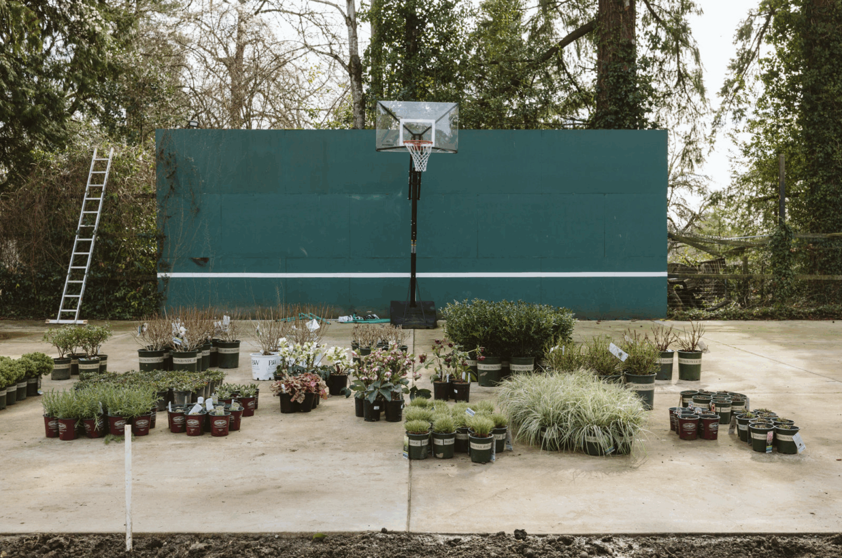
Opening Image Credits: Photo by Kaitlin Green | From: How We Turned Our Run-Down Tennis Court Into A Pickleball Court (Spoiler – It Was Quite The Process)
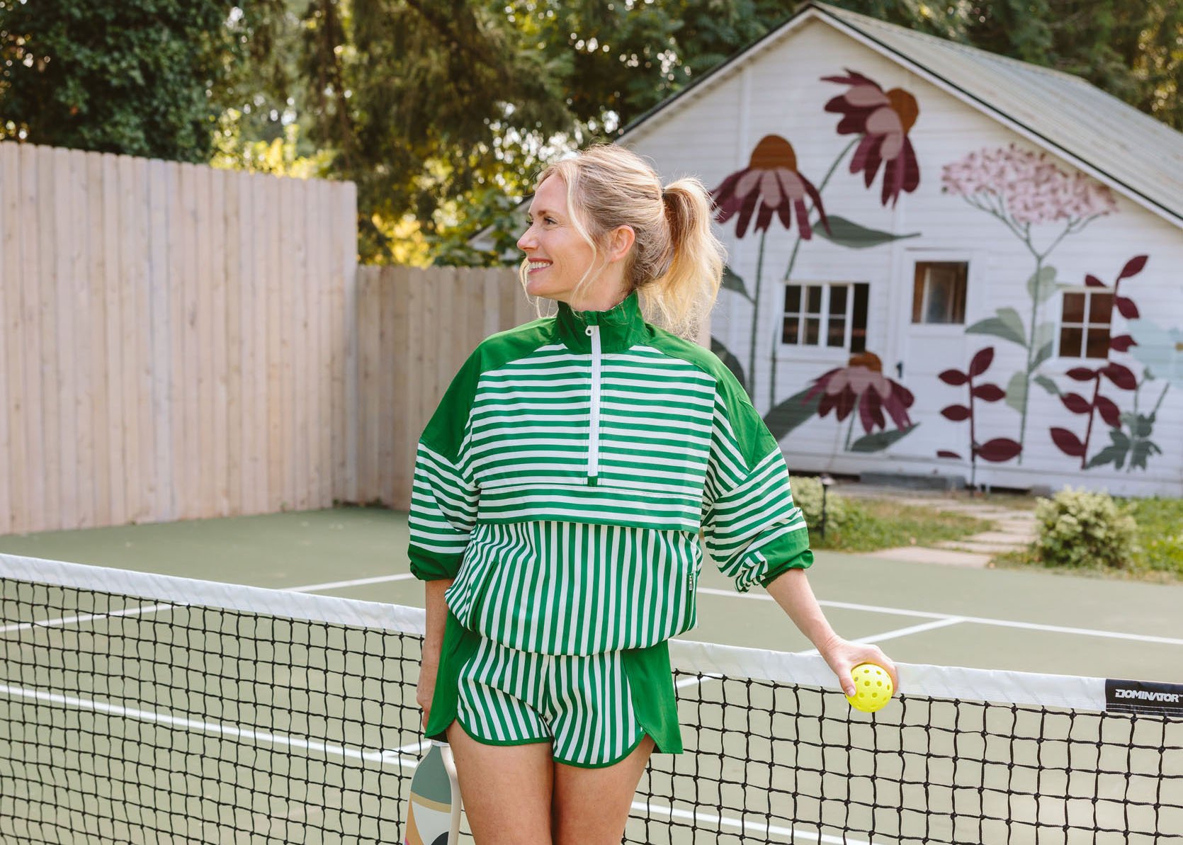
Y’all, there is a lot of pickleball fashion out there, and I tried on all of it (including a million dresses that didn’t feel like “me” but were so cute). People are wearing it everywhere – less so in Portland, but when I was in New York and recently up in the San Juan Islands. I took note!! The skirt is having a moment, for sure, and while athleisure is changing a lot right now, I’m mostly interested in what I feel comfortable in that I’ll look forward to putting on my body. If I lived in LA, I’d likely go a little more fashion-forward because you wear your pickleball outfits around town afterwards, but here I’m less motivated to wear a whole curated outfit and instead like to look more casual.
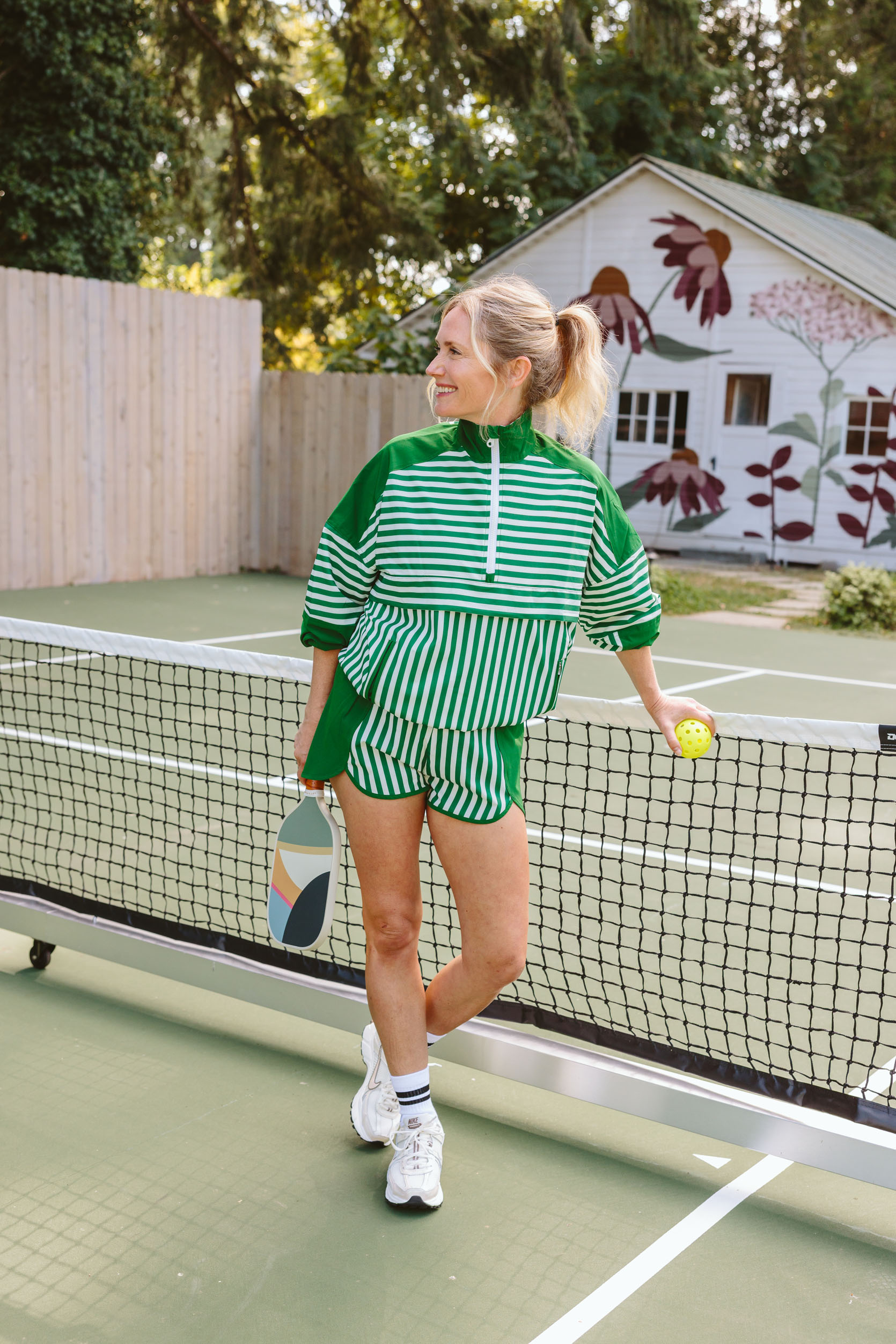
Anthro Jacket | Anthro Shorts | Socks | Shoes | Recess Paddle
That being said, that set above is SO CUTE with the shorts being something that I would wear often, and I’d separate the two easily, obviously.
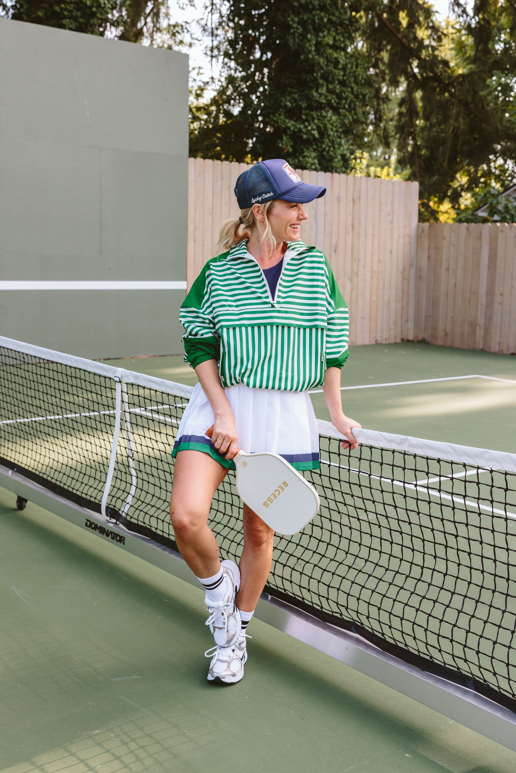
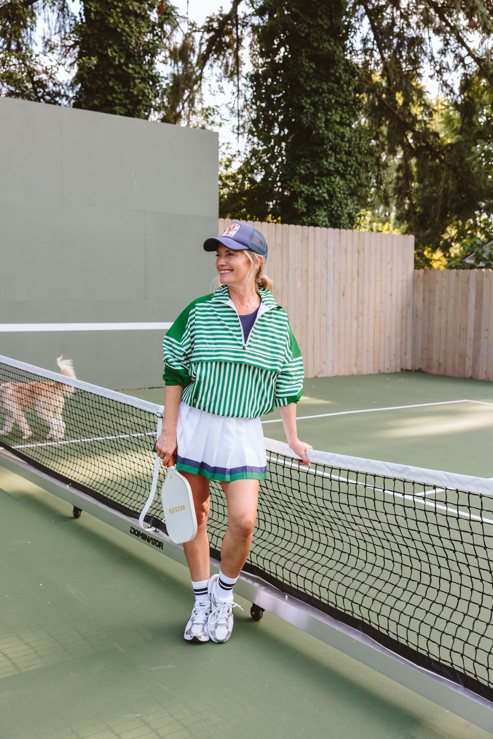
Hat (similar) | Anthro Jacket | Anthro Skirt | Blue Top | Socks | Shoes | Recess Paddle
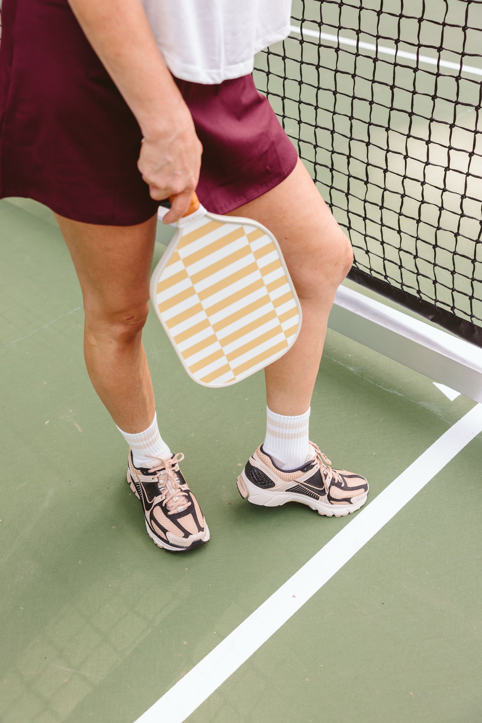
The varsity trend is certainly still thriving – it’s so cute, but feels less me (I like the skirt so much in theory, but I prefer shorts on me :)). This skirt had a great waistband (wide and not too tight) and was generally really flirty and fun to wear. And those are my new favorite all-day, every-day Nike shoes. So comfortable, and I’m feeling this cross-trainer trend.

Nike Sports Bra | Nike Skirt | Muscle Tank | Socks | Nike Shoes | Recess Paddle
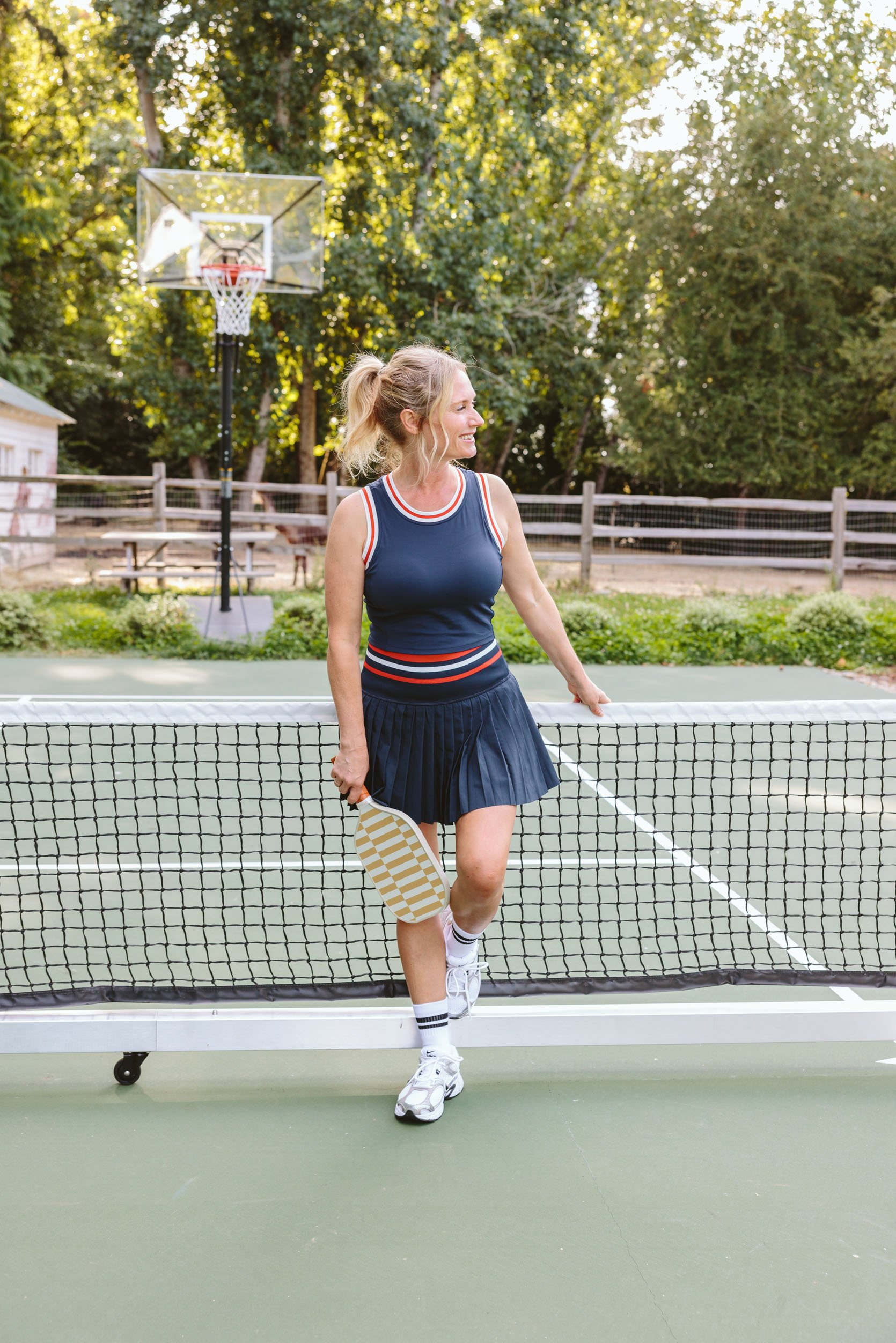
This was my favorite look for sure that felt the most “me” – the Nike skirt (with shorts underneath) was really comfortable and flattering (and still felt athletic, easy to move in with a really nice soft fabric). I liked that it wasn’t pleated (I think the pleats might be too preppy for my style?) and instead it’s a fit and flare. I’m wearing the matching bra here, which I LOVE, and most people would just flex the matching set. But I love throwing this muscle shirt over it (I want to buy this in a few colors) – it’s loose, a bit see-through, has a big open sleeve that feels edgy but with the modesty that I clearly prefer.
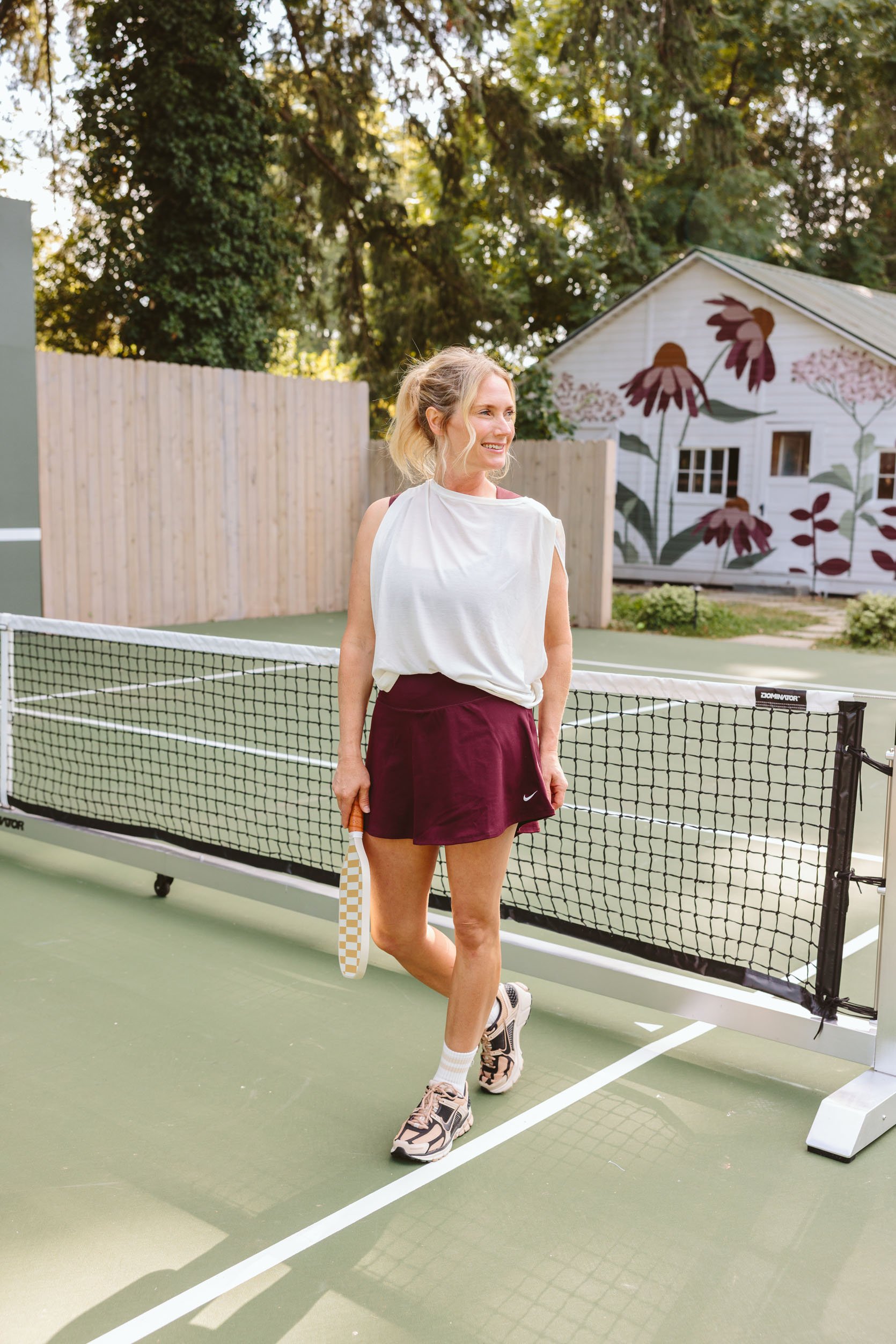
Nike Sports Bra | Nike Skirt | Muscle Tank | Socks | Nike Shoes | Recess Paddle
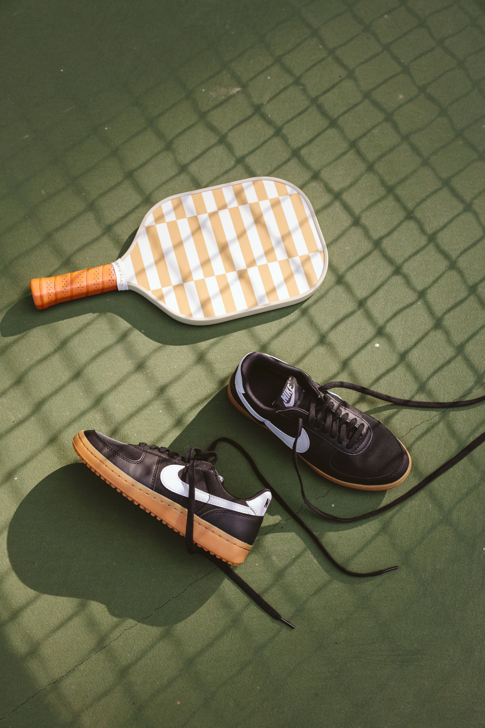
We all went wild over these shoes – Kaitlin even took them home for her birthday lol (and I’m likely going to re-buy them for me because seeing them here, I want them back and loved how they worked with the colors of the skirt).

Fabletics Jacket | Leopard Cap Sleeve Top | Fabletics Skirt | Alo Skirt (simlilar) | Socks | Shoes
This was me trying the butter yellow trend (they were out of the matching skirt in-store, so buy online if you want to go full butter). That jacket was a really cute cut and comes in a billion colors. The skirt I’m wearing is Fabletics, but their membership makes it a little hard to buy, so I’m also linking up Alo (I loved their black skirt slightly more, but didn’t shoot both and chose to feature this because it was more affordable). So if you have a subscription to Fabletics, great, but if not, the Alo skirt was extremely good. This look didn’t feel totally like me, but I liked all the pieces individually a lot.

Leopard Cap Sleeve Top | Fabletics Skirt | Alo Skirt (simlilar) | Shoes | Recess Paddle
I did make a couple of purchases from PE Nation, which is an athletic brand that I love for being more fashion-forward but still performance wear. I bought this leopard top with matching biker shorts – I wore the top during our 5-night cycling tour through the San Juans, which I have yet to tell you about, and it made me feel so good, stayed put, and I felt like me (but with padded shorts, lol). And no, you don’t wear those Nikes for pickleball, but they are rad and are great street shoes for fall.

Berlook Top | Berlook Skirt | Socks | Shoes | Recess Paddle
This set is super cute, full coverage up top, and the waist on the skirt stayed put.
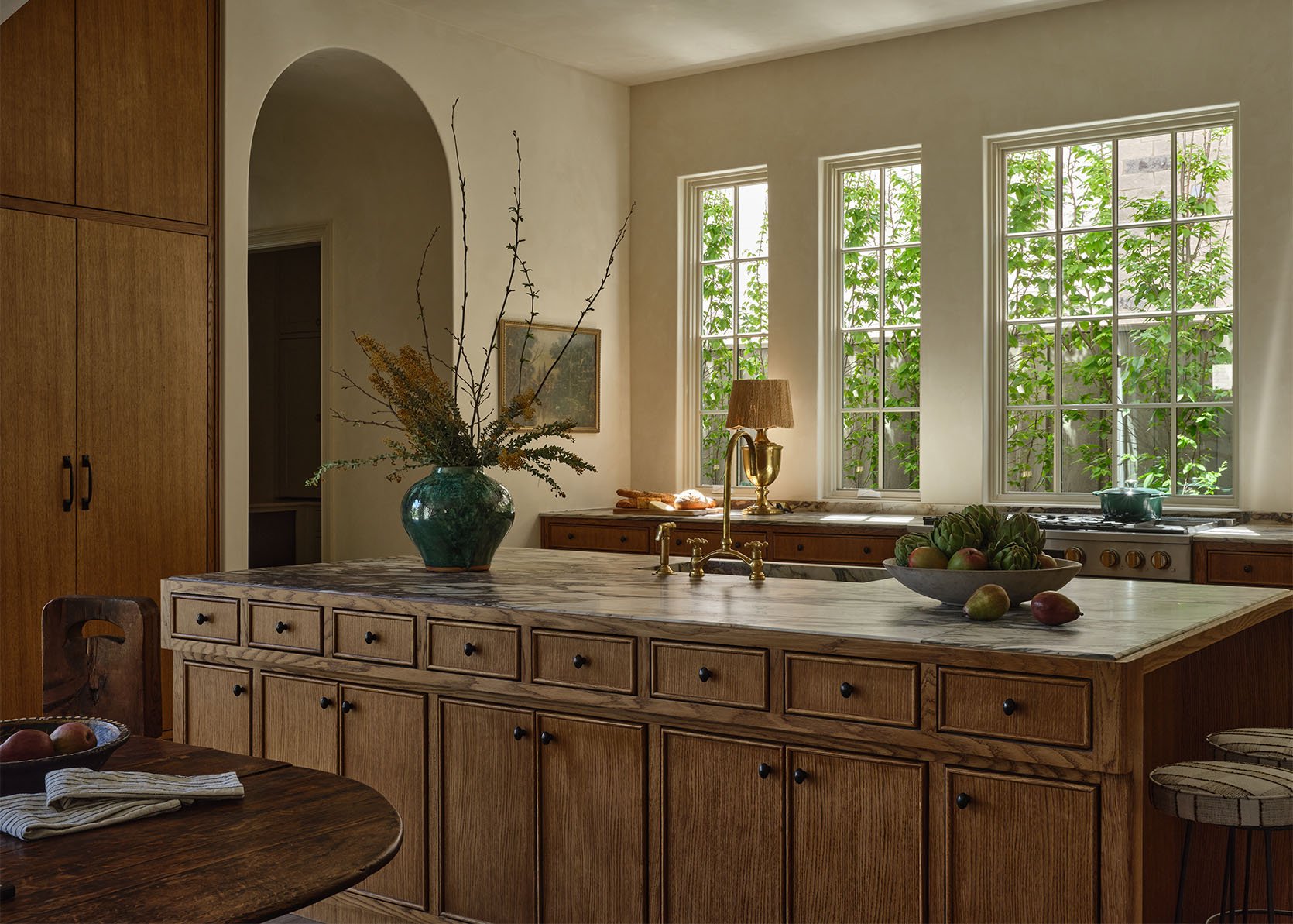
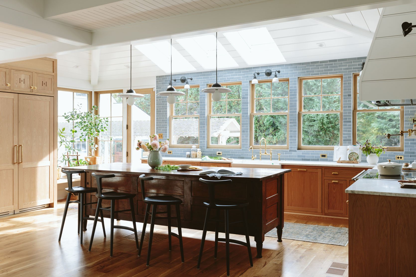
While I myself have yet to remodel a kitchen, I have been privy to many other people remodeling theirs. And especially if you don’t have a design background or a hired designer, all of the basic decisions and budget balancing can be A LOT to manage. Then all of that decision fatigue doesn’t always leave enough space for the more custom or creative things you could implement. One of those creative (and potentially, budget-friendly) decisions is mixing cabinet front styles. I’m of course not suggesting that every other door is a different style. But if you have uppers, a little cabinet nook, etc., you might be able to switch it up a little, making your kitchen that much more unique to you. Let me show you what I really mean.
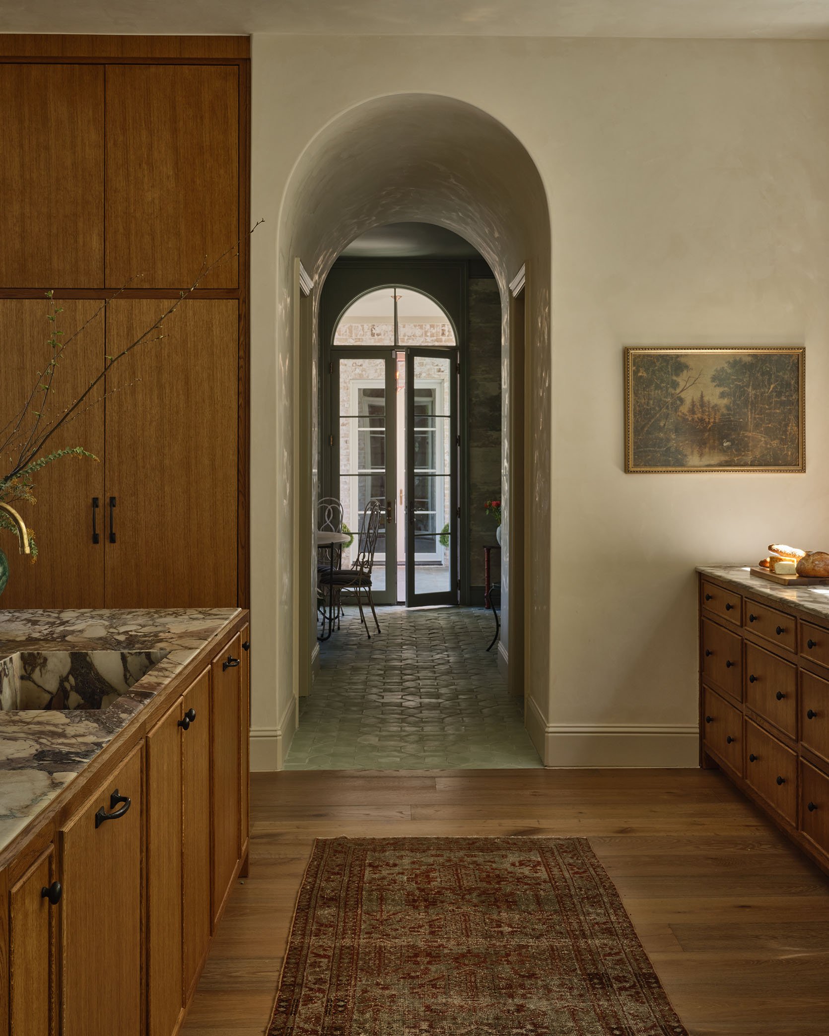
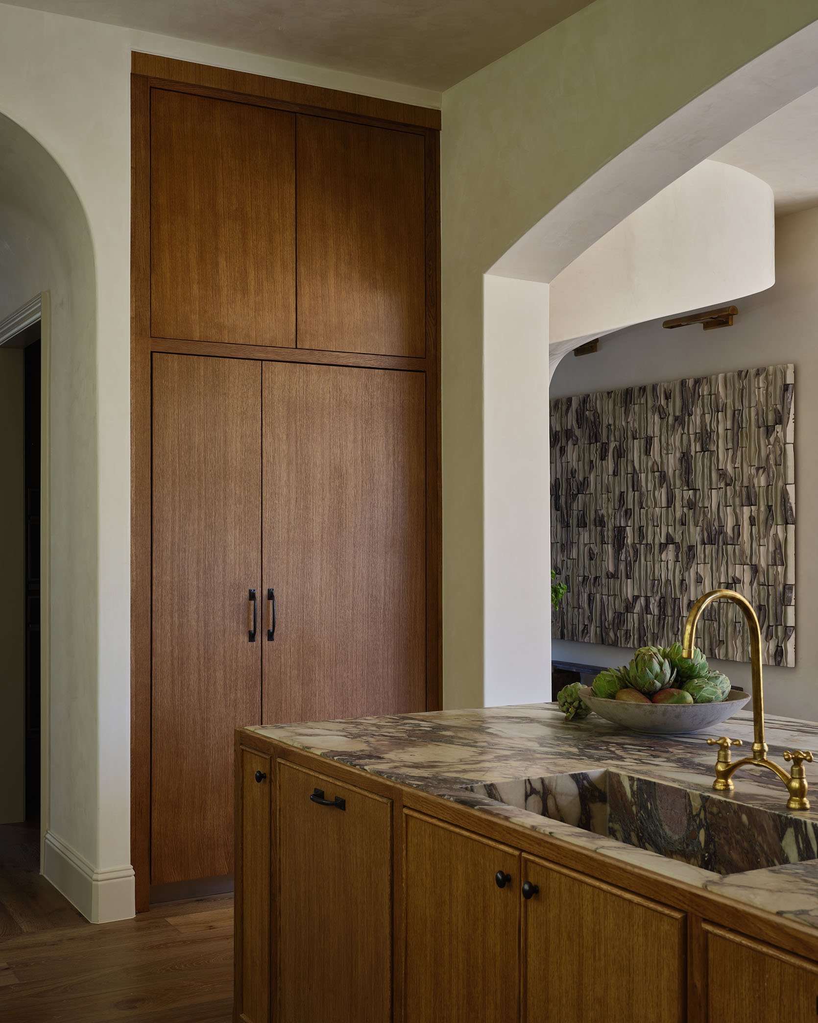
Recently, I wrote about this house above and all its amazing uses of large-scale art. I did also happen to mention the mixing of cabinet front styles. The island and main cooking counter both have a thinly beaded cabinet front, while the tall cabinets (probably fridges?) on either side of the kitchen have flat panels. It’s kinda subtle until you clock it, and then it just makes the kitchen all the more interesting. This kitchen is what inspired this whole post! Here are some more examples/options if you are in the kitchen remodel idea market:)
I feel that this is the most common/classic “style mixing” combo – Shaker cabinets + flat drawer fronts. It’s classic, a little fun for the eye, and I wonder if it’s an “easy” way to save money. Flat panel cabinet fronts are generally more affordable than any of the other, more decorative options. Of course, it depends on the material you want to use:)
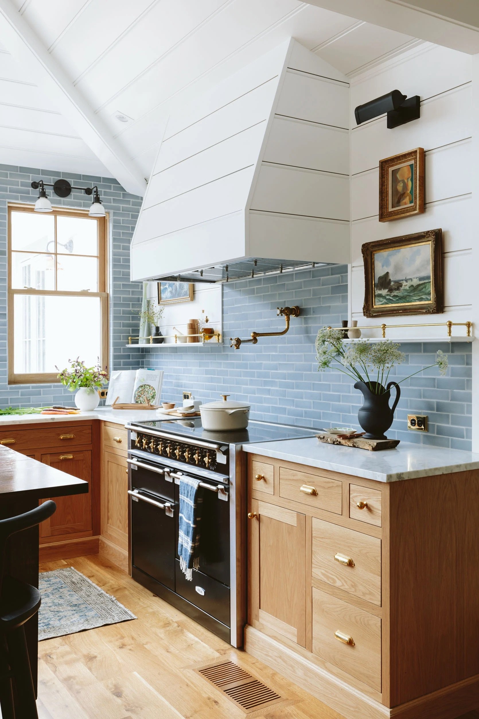
It’s actually what Emily did in her kitchen!
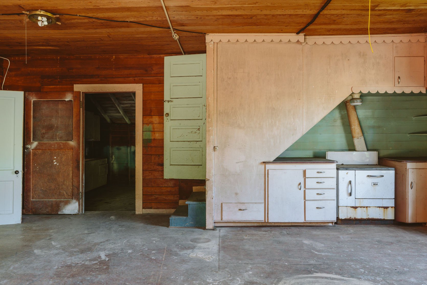
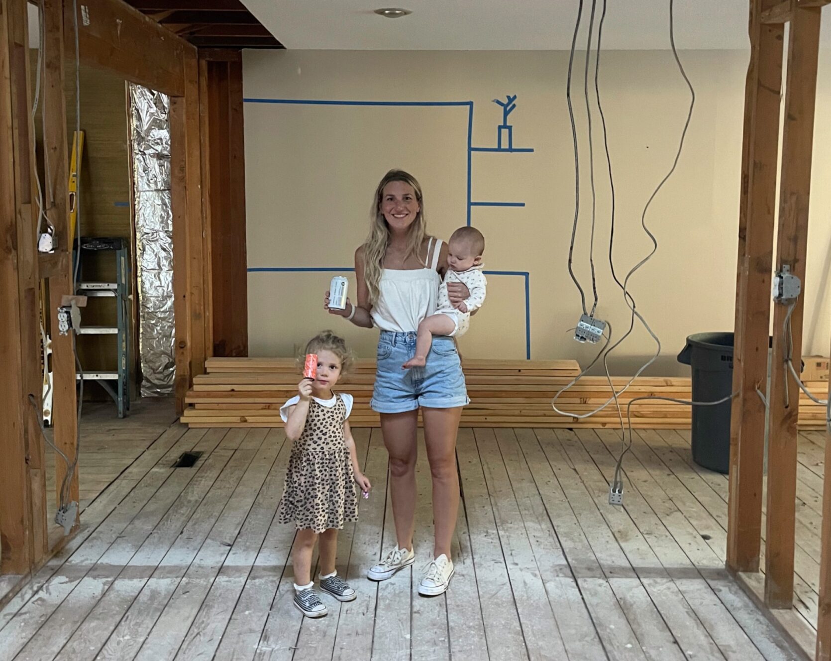
A few people keep asking the same questions about this project, which made me realize that I don’t think I’ve talked about them. Maybe this project came out of nowhere, like, there is another house on the property? A guest cottage?? So it seems like all the whats, who for, whys, and hows (and how muchs) need to be addressed. So today I’ll do my best to answer the macro questions with the answers as of now – knowing that, of course, they might change and shift as time goes on, our family grows, or new circumstances arise.
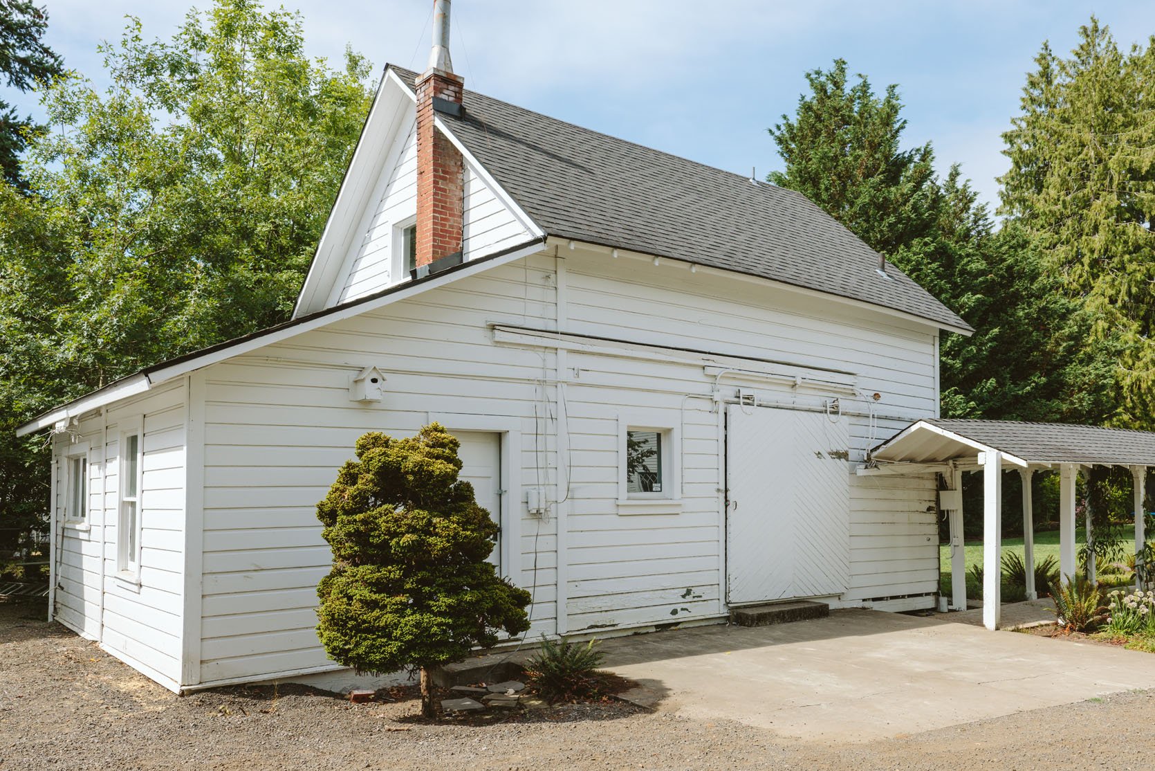
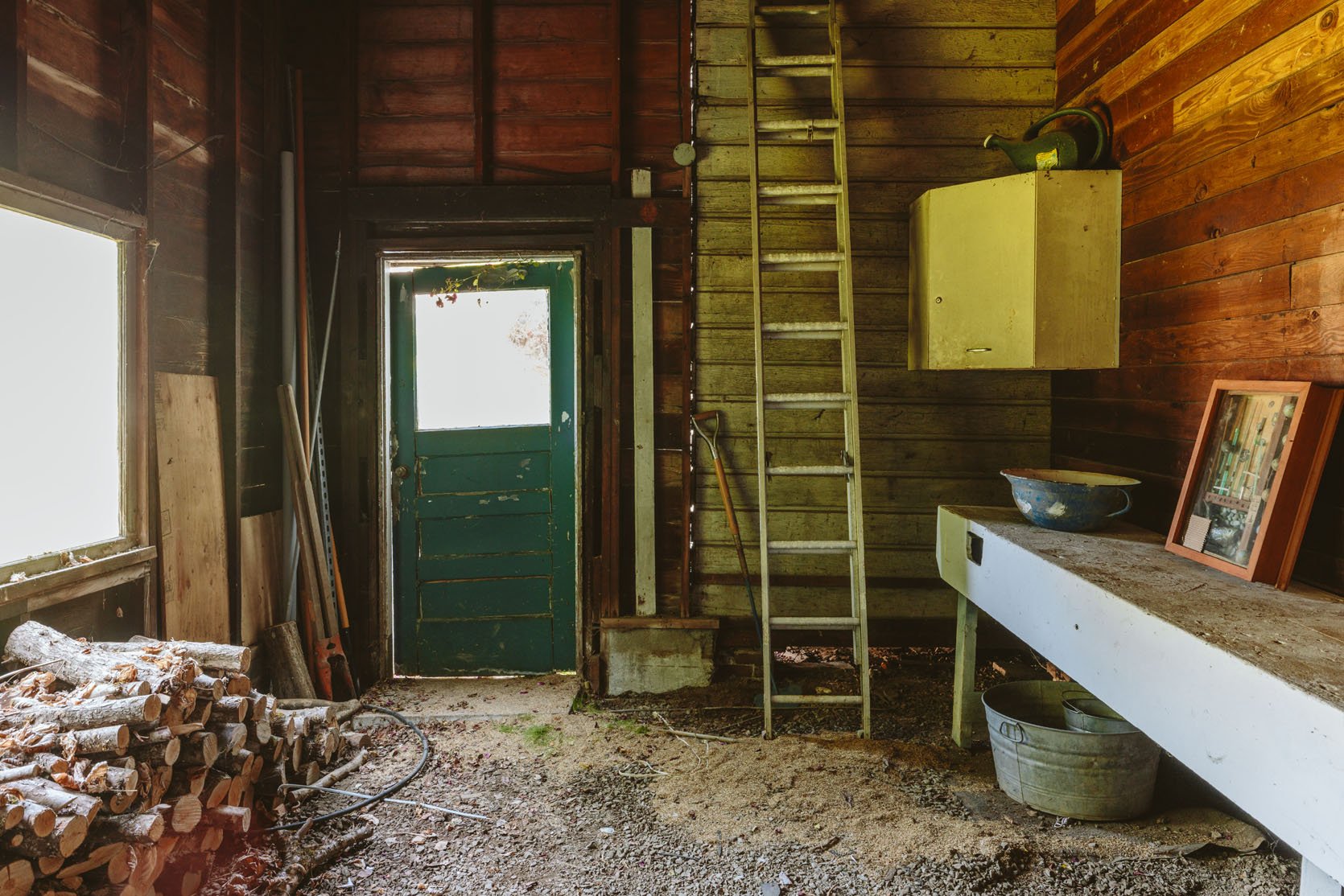
The best answer is that since we aren’t sure, we want it to be a big flex space that one could live in if needed (thus calling it the guest cottage). Upstairs could be my office, the canning room could be a music room for the kids’ band (i.e., drumset), maybe a game/rompus room for the kids, and yes, a guest bedroom. In 10 years, we might be fully renting out the property, which might change every room. If a family or loved one ever needed to move in we also want it to be fully functioning home, but since it’s not for our family to live in, its, in fact, an “extra home” on the property, we aren’t going to treat it with the same level of amenities that we would if we lived in it. For example, it will have a functional kitchen, but it will be small and super efficient (not a huge fridge and no beloved pebble ice machine, lol). It will have one full bathroom and maybe a 1/2 bath upstairs (toilet + sink). If it were for us, we’d likely do two full baths and a powder. It won’t be “bare bones” per se, but since I’m not thinking about how we live there or how our family of four + 2 pups would need to flow through it every day, it will be whatever is most cost-effective and makes sense. The kids want it to be their teen hangout space, which I would typically laugh at, but we have ALLLLL the kids over here all the time, which we love, so part of me is thinking maybe we do make it a big bonus area for them so I keep them nearby (under my watch) as much as possible. Elliot wants a gymnastics room, Charlie wants a gaming room (they both know they are dreaming), Brian wants a speakeasy, LOL. But what about me?? I also don’t have a dedicated office, so the upstairs could work well for my Portland crew to meet, so they don’t have to be in my house (which sounds fine at first, but it’s not ideal to be inside your boss’s home all the time). In fact, we rarely “work” here – we shoot here all the time and will meet in person if we aren’t on a team Zoom, but since it’s in my home and kids/dogs are around, if they need to be working on their computer prepping content, they always do it at home. In a way, this works because it’s very hybrid (which I think is ideal), but there are days when I think working together in more of an office setting would add to collective creativity. So, since we don’t know, we’ll make it functional but not design any room specifically with built-ins, or we won’t change the layout because we simply don’t know what it will be used for.
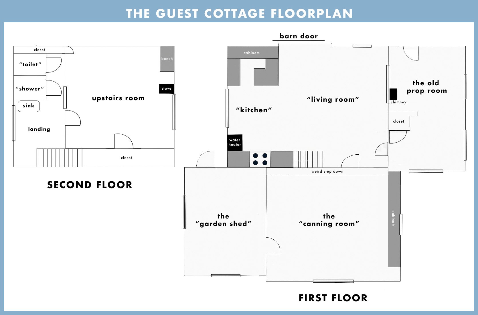
Nope. We do not want to move any walls. The only one I’m trying to figure out is the interior room (the “living room”) that looks out to the chimney in the other (old prop) room. Curious if we open that up, close it, or just embrace that oddity. We want to add the full bath on the first floor (especially if anyone older needed to stay with us – those stairs would be dangerous), but we hope to do it under the stairs where some of the existing kitchen cabinets are (tbd).
I’ve done enough projects to know that this could cost a lot – $500k easily. Remember, it needs a completely new foundation, all new electrical, plumbing, HVAC, sewer tie-in, engineering, a roof, windows, and it has asbestos, mold, and pests. She’s not in good shape. So the answer is that no, we don’t have that budget. So we are going to hustle hard to book whatever partnerships make sense for this restoration and do it slowly over time, creating content we hope will be really enjoyable and engaging along the way (which is the business). We will spend/splurge on the stuff that we HAVE to (foundation) or design elements that we are extremely excited by (i.e., maybe hiring an artist for stained glass window panes or doing that custom English-inspired metal and glass door behind the sliding door that a lot of you mentioned in the comments). Essentially, this won’t be a super budget story because, by nature of the extent of work, it’s going to add up. But I’m not wiring for sconces, I’m not ripping out the old wood floor to put in new pretty herringbone flooring – we’ll be very specific about how we spend the money and really, really try to use everything that is worth salvaging in the house. We won’t add “good to haves,” only “need to haves” (don’t quote me on that). Like all things in life, we’ll strive for a balance, and it will be full of trade-offs.
This is the first project that we aren’t hiring a General Contractor (as of now) to save money. I really, really, really want to learn the entire process, and we aren’t in a rush because we don’t need to live here. So I will absolutely be hiring my brother when it makes sense (or just asking his advice help ALLLLL the time). So I’m going to try to project manage this on my own, get multiple quotes for everything, hire the subs by myself (good luck to me!), etc. I will not be doing this totally on my own – I have Gretchen, Brian, my brother, who I can lean on when it makes sense, and I might be recruiting other friends/experts. I have NOT reached out to all the “restoration coaches” that emailed (I’m so sorry – I’ve been secretly out of town so much!!).
I mean, all the obvious stuff, right??? I’m sure it’s way more. The more relevant list is likely below.
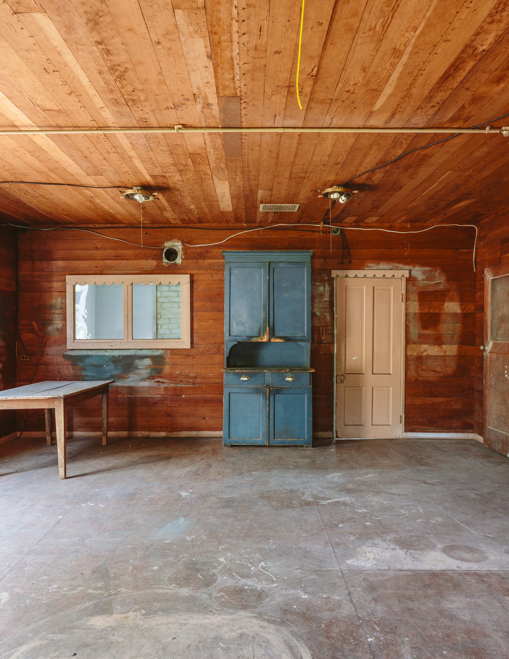
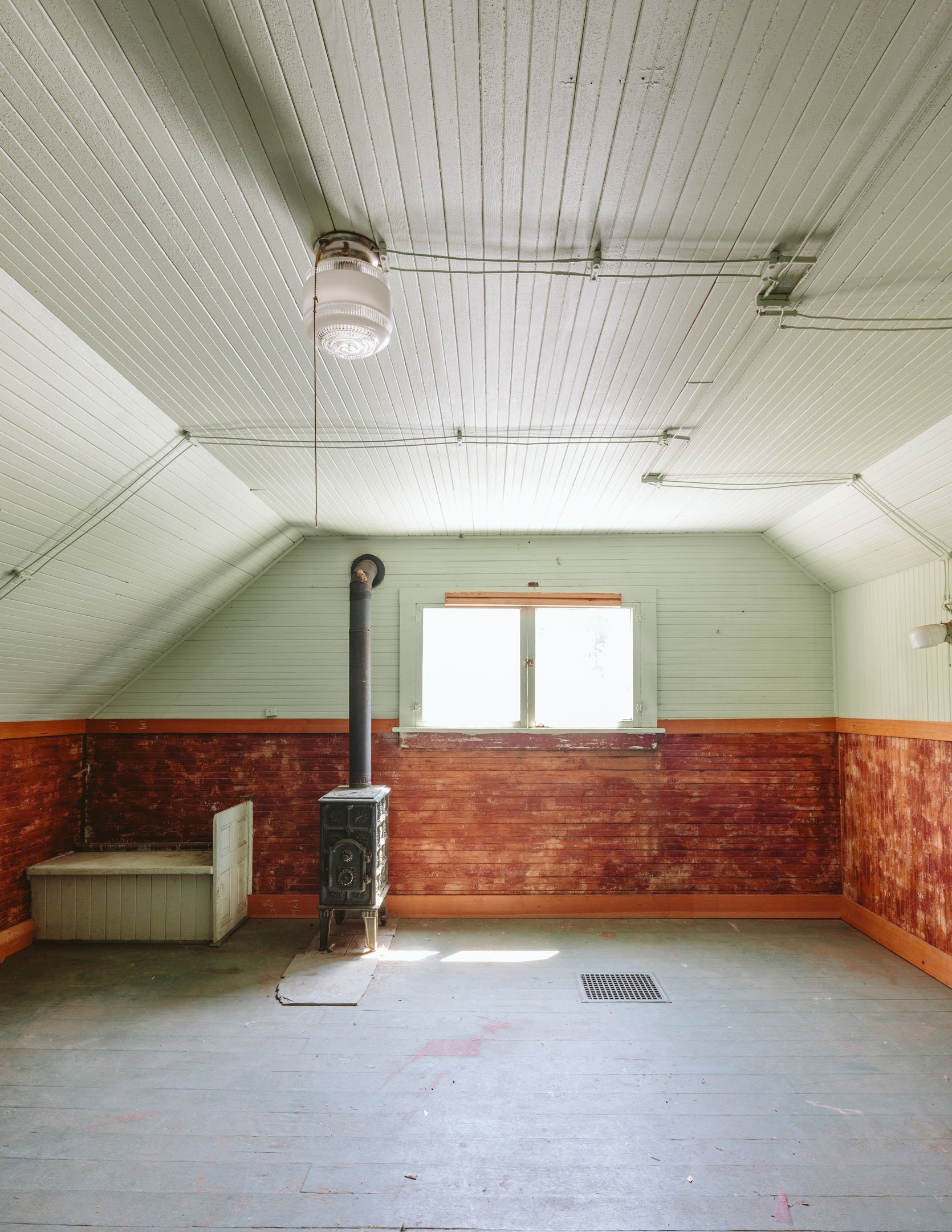
I don’t know! Definitely vintage, cozy, vibey, and heavily inspired by what it was before (it’s so charming). I’m always drawn to Scandinavian and Victorian (together), but no, this house won’t just be a smaller version of our house. But it won’t be this wild departure, either. I love living in our house so much – the whole thing flows so well, it doesn’t feel busy at all, and it’s easy to maintain and feel fresh/clean. But I’d love to make this guest house really vibey and colorful. Still comfortable and easy to live in, but I can’t, for instance, add wallpaper anywhere because there is pretty paneling on every surface – including the ceiling. I know you guys might be sick of hearing me say “simple but special,” so maybe I’ll have to rebrand that for a bit, but it’s still what I love to live inside. Just more color, whimsy, unexpected patterns on fabrics, and maybe more fun?? I also really don’t want to fall into the cottage core or granny-core trends. Yes, Scandinavian is less “in” right now, “Old World England,” aka hyper traditional, is way more du jour, but I still prefer a pared-back warm vibe. And I’ll always love modern art 🙂 What it won’t be is hyper post-modern, and yes, you can expect some Room Service furniture in there as we expand the line.
Listen, I like to move fast because it’s fun and I love this part of my job so much, but we have to spread this out to pay for it. And listen! I’m so excited that for the first time, I don’t have to rush. A renovation usually involves someone trying to get back into the room to live in it, it’s usually so disruptive to our lives, but not this one. I guess I’d be psyched if the kids have it by mid-junior high, but knowing me, it will be before that. When I get a bee in my bonnet…
Not yet, but I approach every new job, new project on a case-by-case basis. And I have to know the rough timeline before I can pitch them and guarantee my deliverables. For now, I fantasize about what partners would be right for this particular project (a list of what we need and what we want is happening), and then I pitch them (which is a lengthy process, sometimes taking months). Since I want to do a lot more hands-on work here, maybe there is a larger home renovation brand that I could pitch for a longer-term partnership to be our go-to source. Maybe there is an online platform that wants more video content that we can produce in-house. I’m looking more at macro partners, not tile or lighting. At this point, I know what I need to do to stay healthy as a business while depleting our resources through content creation/renovation. It really has to feel right in this vintage home and be something that I’m excited about, design-wise (or just really, really make sense).
Well, fixing the foundation is first (and will likely take months). I received the first quote, which was a lot, but we kind of knew that (I will be talking openly about some of the financials where appropriate). Looking for more quotes now to really make sure that we are hiring the right crew. Meanwhile, the blog posts will be more about the beginning stages of the design process and solving all the quandaries. The articles will be based on what is actually coming up as a problem to solve or a design conundrum worth bringing to you. I’m sooooo open to all your ideas, feedback, and questions. We will likely treat social and YouTube differently, but my hope is to continue the Thursday guest cottage cadence. Even if it’s just an update with the latest electrical quotes or some design inspiration that I’m obsessed with.
I’d really like to hear your ideas on what you’d love to see. Here are my hopes:
We are also doing a lot of decorating makeovers, knowing that this project will be in the restoration stage for a while, so if this isn’t your thing, don’t worry – it’s all a balance. Thanks so much for reading 🙂
*Photos by Kaitlin Green
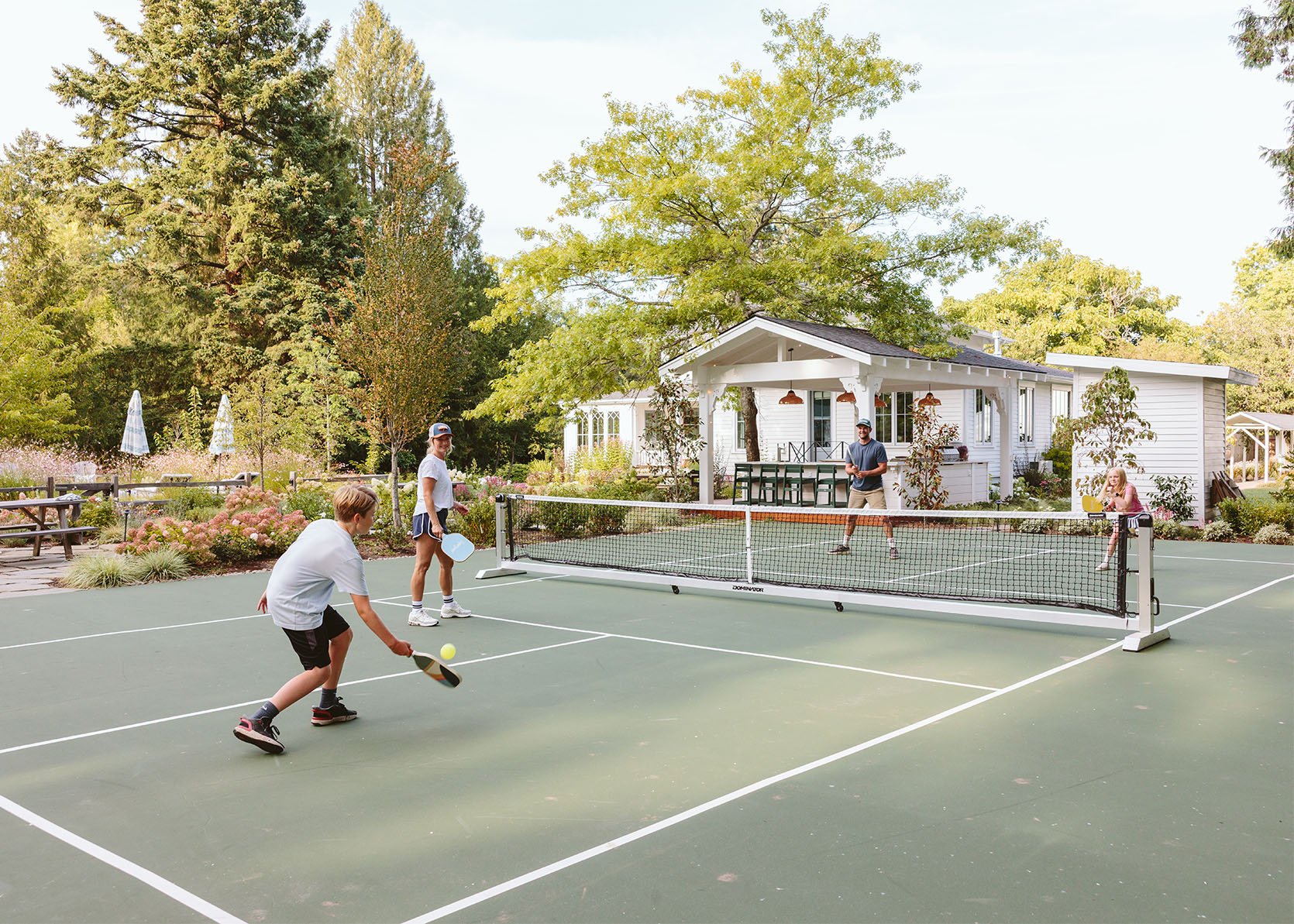
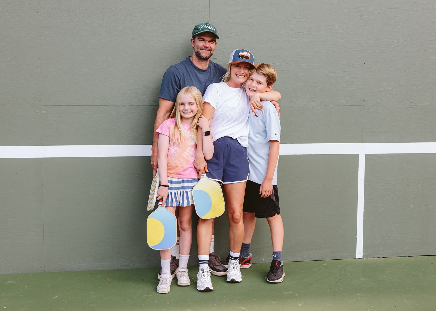
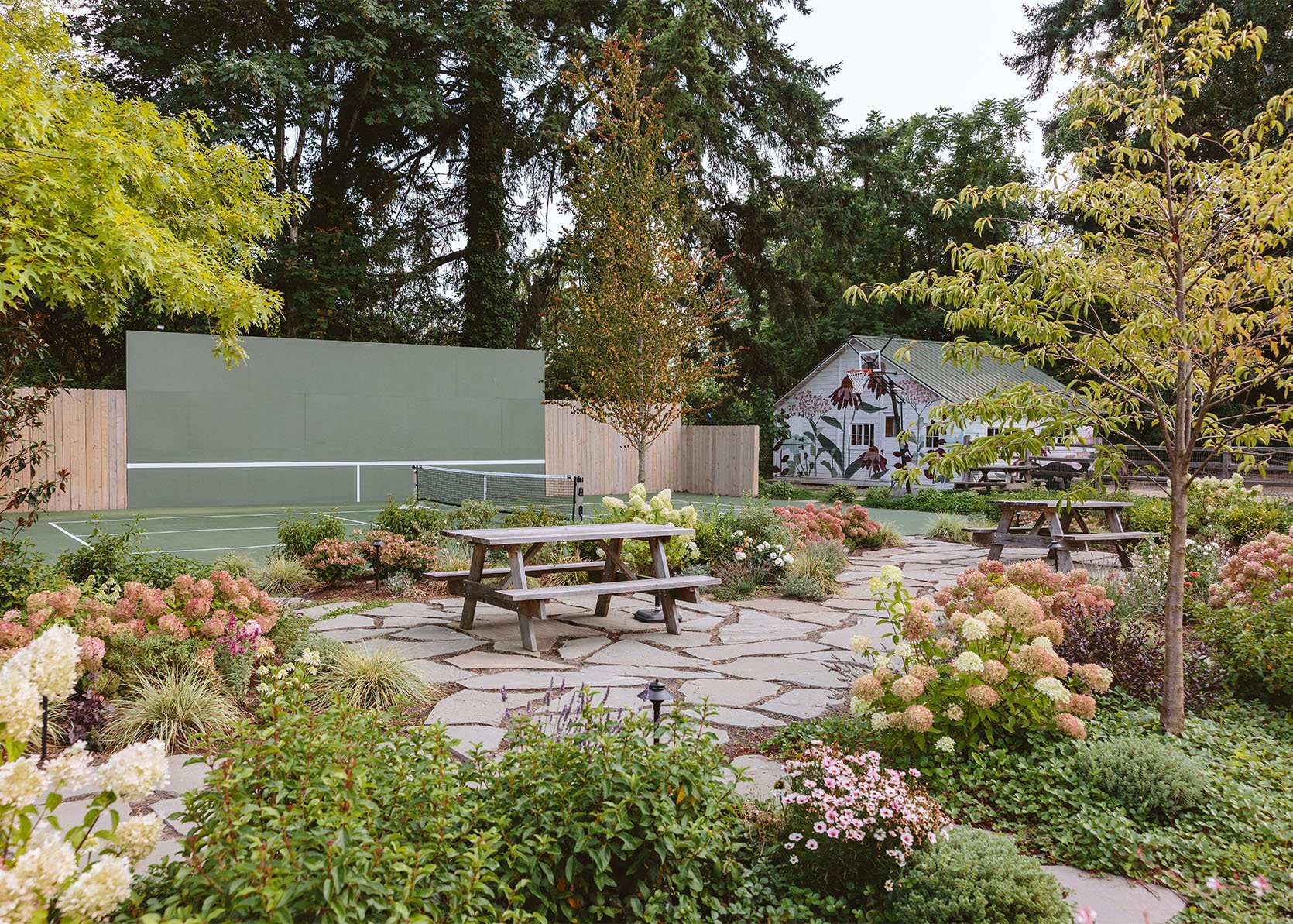
I definitely didn’t envision a pickleball court here when we bought the property 4 1/2 years ago. Sure, I knew we’d make improvements to the broken tennis court we inherited, but I don’t think I had even heard of this “pickleball” then (now the #1 growing sport and so much fun, TBH). The whole thing is just ridiculous, and we are wildly grateful to have been able to do this. And after last weekend’s second annual pickleball tournament (a fun “party board” neighborhood school fundraiser), it was incredibly rewarding to see it so well-loved/used by lots of friends/neighbors (and formidable teams that slayed us). Let’s back up because it didn’t happen overnight.
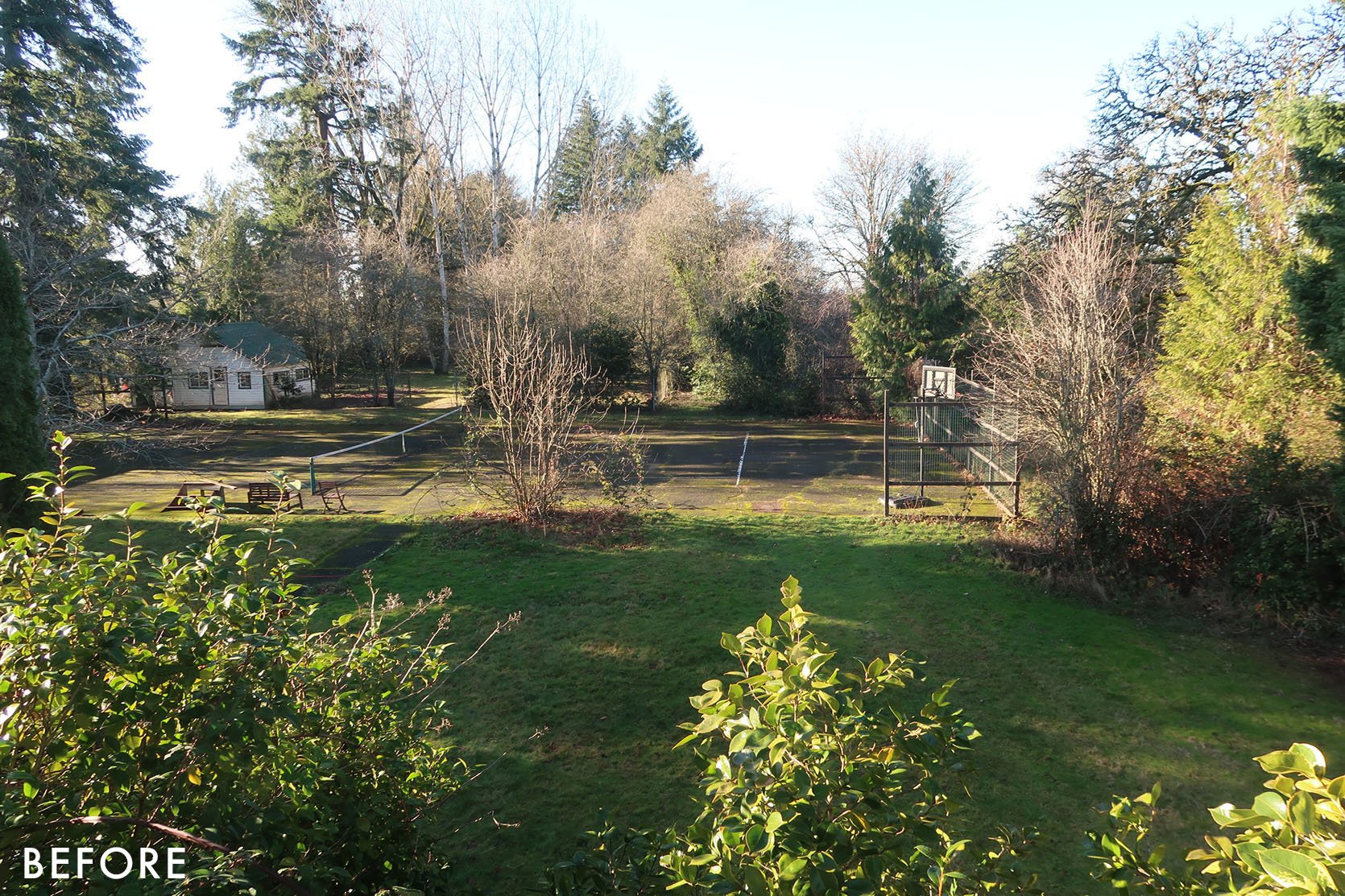
She was charming and rustic. We loved the idea of a sports court and naively thought we could just resurface this one, although it was HUGE (tennis courts are massive, but this one was even much larger with tons of space all around it). The asphalt was broken everywhere, with tons of weeds growing through all the cracks.
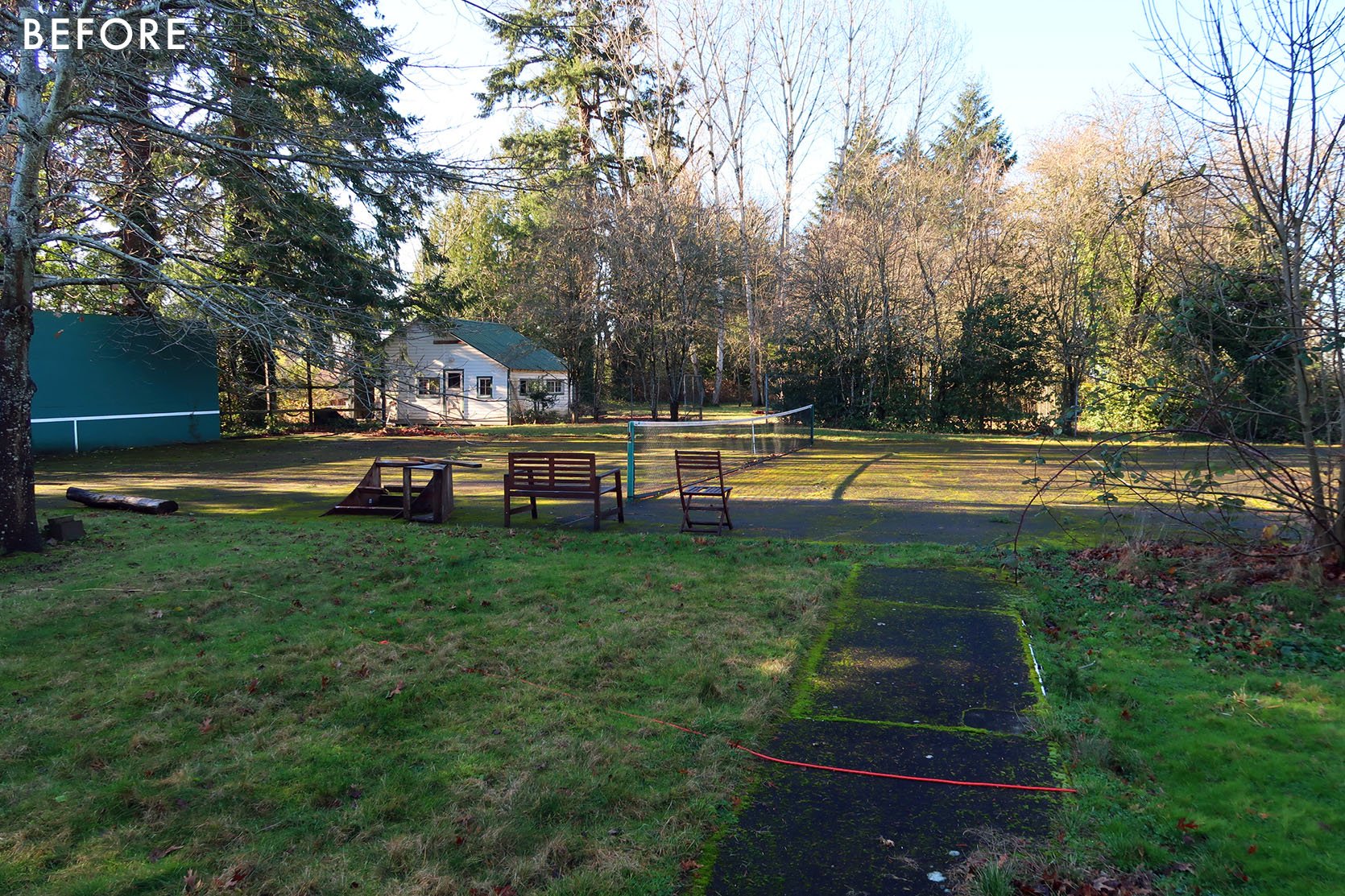
But there was such a sense of play and fun just having it there. We envisioned years of kids playing here with their friends and a lot of parties. I barely thought about this area, as I was super focused on designing the house, all the insides. Brian certainly had dreams over here – not of a pickleball court but of a sports court for basketball, rollerblading, etc.
But then we learned the reality – that no one will just resurface broken asphalt. It will only continue to crack because the foundation is so poor, and no one wants that on their company’s reviews.
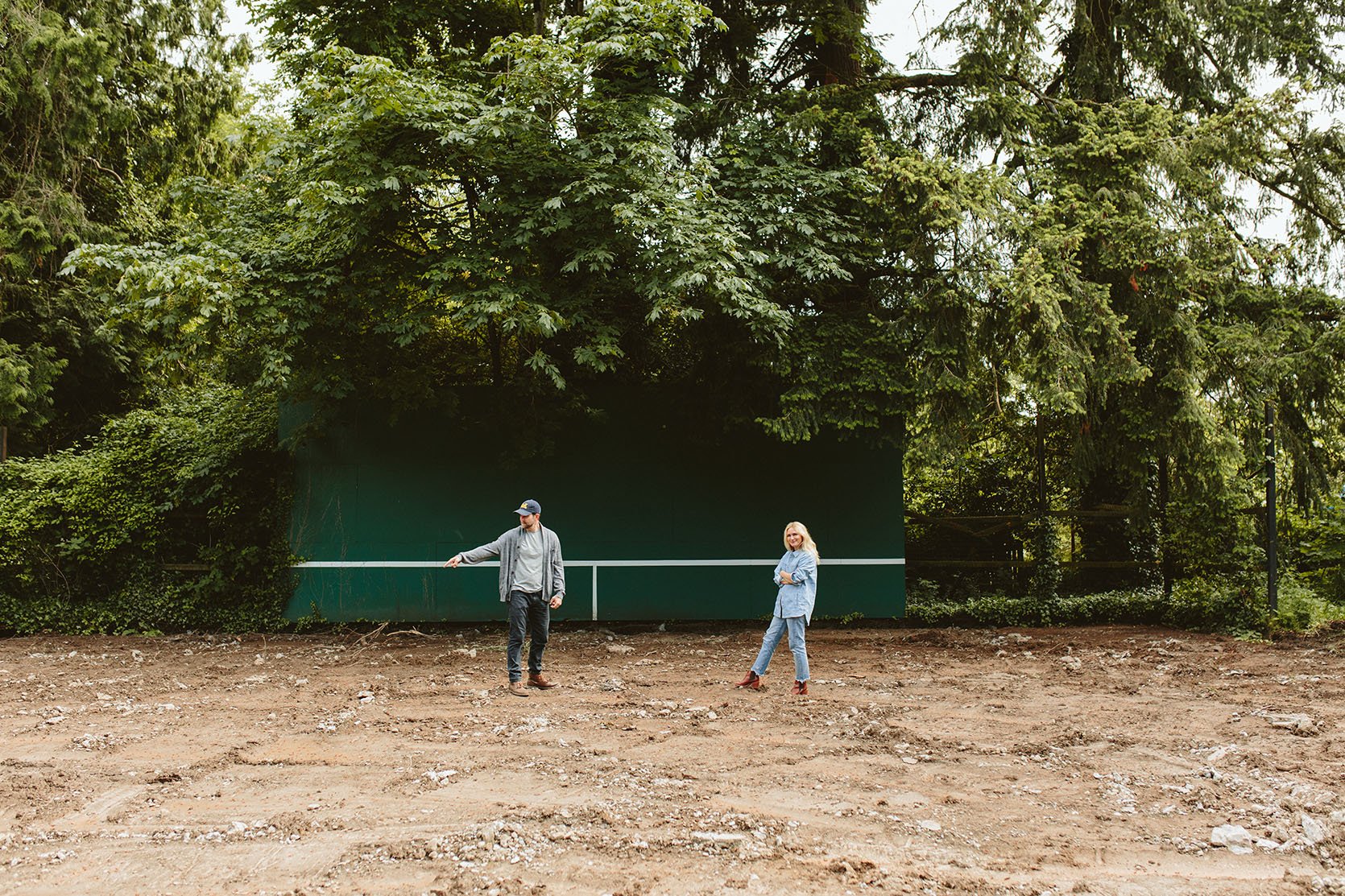
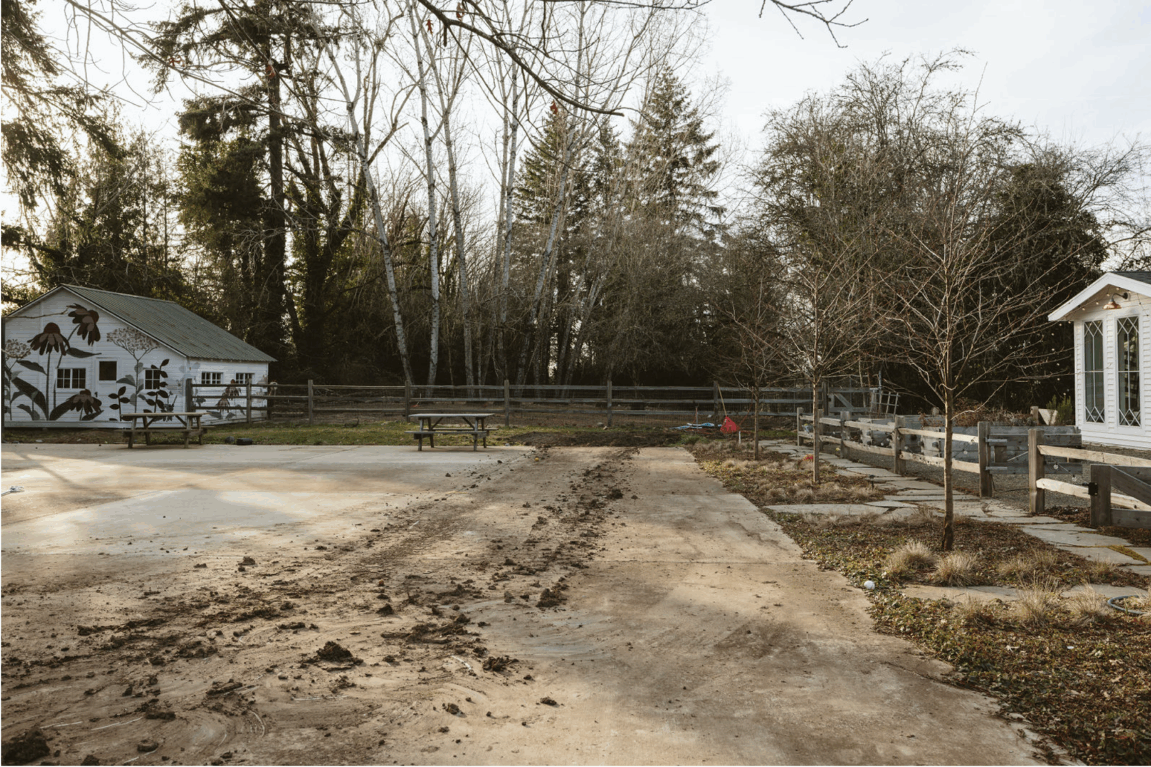
So, unfortunately (for the budget), we had to demo out the entire court or keep it. The only positive of this was that we needed gravel for an access road up the hill, so they brought in a huge truck that turned the broken pieces of asphalt into our gravel road (not total regrind, but a layer of it in addition to even more gravel that we had to pour).
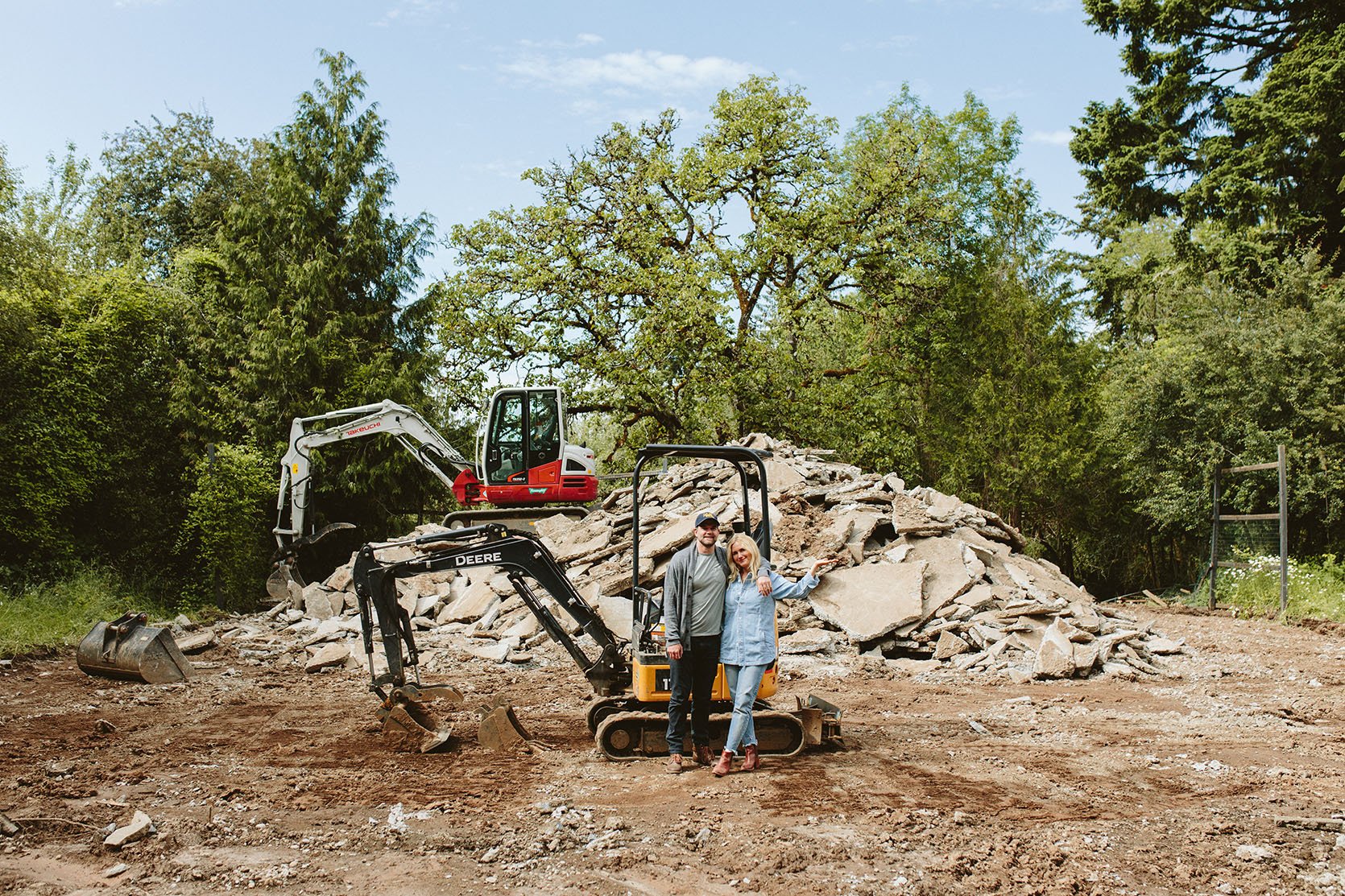
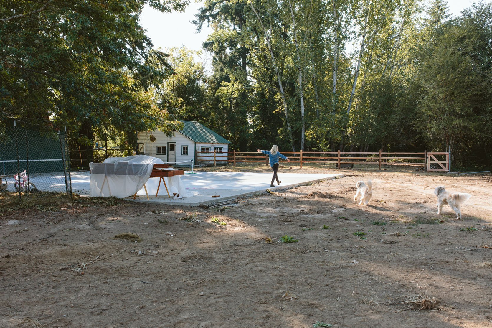
Once it was all dirt, we poured new concrete, 1/2 the size. I still felt that it was too big, but Brian, envisioning so many middle-aged dad pickup games and years of our kids playing horse, thought it was the perfect size.
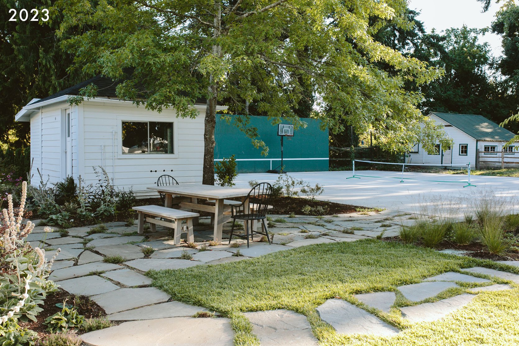
It looked so much better, and I certainly could not complain. At first, the fresh concrete was just so pleasing to look at (which, spoiler, gets dirty with months of annual rain). But in my mind, to myself, I would say, “It just looks like a parking lot”. But it wasn’t painted/finished yet, and I thought maybe that was it? But the longer we lived with it, the more we really wished we had more greenery, more softness, and we didn’t want to invest in finishing it if it wasn’t the right size. So we put it off.
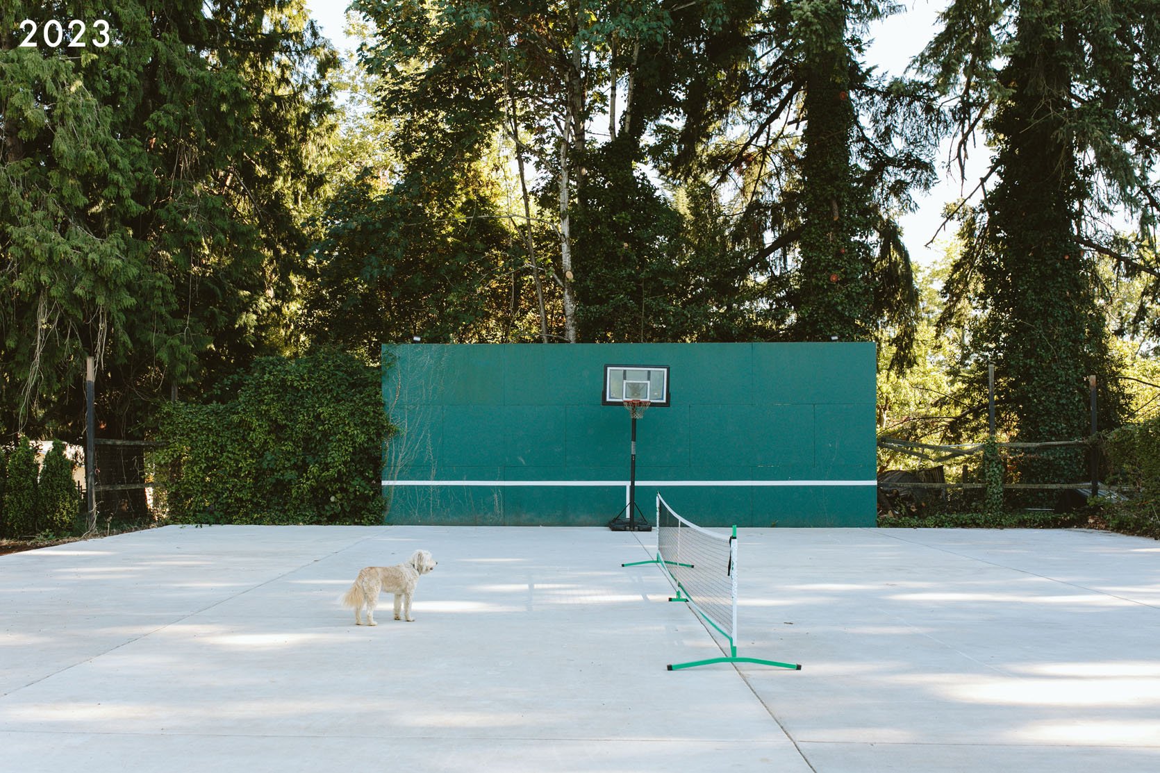
Meanwhile, the tennis wall was not in the best shape, flanked by a very old fence that was in even worse shape (super broken and covered in blackberries and ivy). We didn’t mind all these things at first and played on the court a TON (including our first pickleball tournament last summer). But I felt that I had done wrong by the property by having too much hardscape and just craved softness.
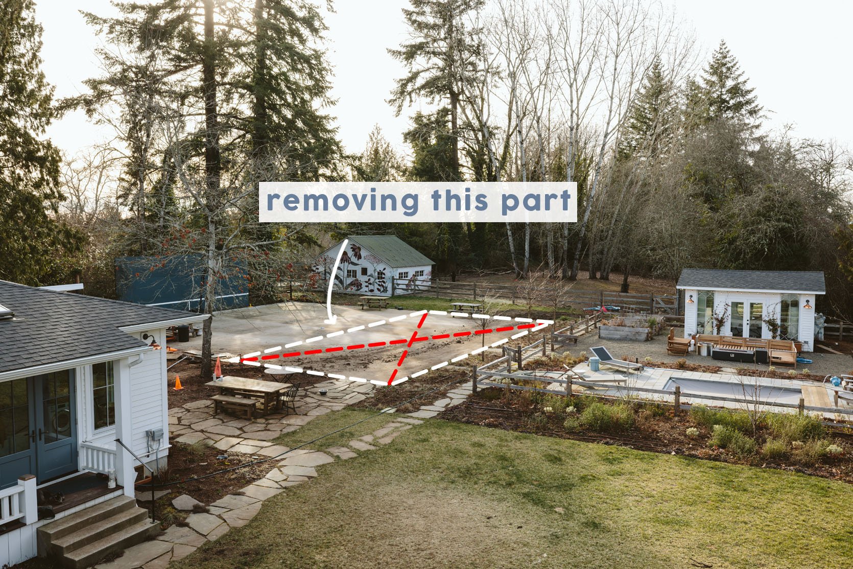
I had no idea how to do this, but Dennis’ 7 Dees did. We hired them to remove a big chunk of it so that we could make that space softer, but still usable. It was gone in 2 days and I was so relieved. I knew we’d add some stonework for paths and places to hang, but the big block of hardscape would be gone in favor of lots of greenery – trees, shrubs, evergreens, and perennials.
But then, in the middle of this all, other things kept popping up…all of a sudden, what didn’t bother us before became such an eyesore – that broken “fencing” that flanked the wall covered in blackberry and ivy. My brother was like, “What are you going to do about the fence and the tennis wall?” And Brian and I both were in denial, saying, “It’s fine, it’s fine!”. But as you can see above, it was not fine. The only reason to wait to fix it was financial (but it HAD to be fixed soon). So we asked ourselves the hard and privileged question: if we are going to fix it in 2 years, are we sure we shouldn’t just pull the bandaid off now, while we are already in construction? We feared this would cost like $15k to do it right (you guys, fencing is CRAZY expensive). We were in the middle of the garage redo and the landscaping, and while I’m still not ready to fully add it all up, it was a lot, and this tennis wall fence just wasn’t a priority. But “future Emily” imagined taking the photos of this stunning landscape with this janky wall in the background, and it would have ruined the shots. She was like, “Don’t be shortsighted, make it look better now”. So I asked my brother, “What if we gave your framing team a $4k bandaid budget – don’t rip out the posts and re-pour the footings, don’t do it the ‘best’ or ‘right’ way, just make it look better for $4k.” They understood the brief and said that in two days it could be “better”. They took off the rotted wood and replaced it, but the structure, including the posts and footings (which were old and in OK shape), remained. The plan was to just nail gun-ready-made off-the-rack vertical planks of doug fir to the existing posts and rails. GREAT.
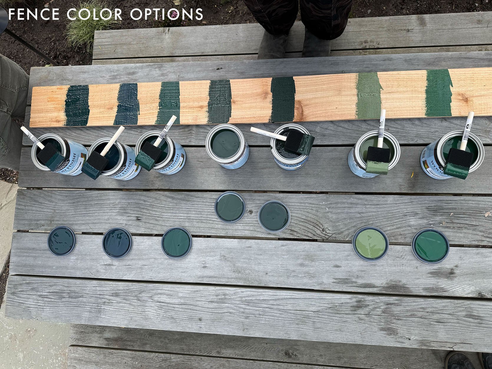
But of course, we needed to choose how the fence was going to be finished, and I had an idea that it should be stained green to kind of “go away” and match the tennis wall. It was surrounded by trees, so maybe a dark green would just disappear? We tested a bunch of colors above, and I had a clear winner.
But when I showed my genius decision to Brian, he did NOT agree. He thought it should just be stained a natural fence color, which was hilariously irritating to me after testing so many greens. I was sure of myself on this one, but Brian was EXTREMELY sure that it was a bad idea. So we compromised after some awkwardness around my team, LOL, and agreed to leave it natural wood. We’d wait til it grays out like the rest of the split rail fence, and if it bothers me, we can readdress it next summer.

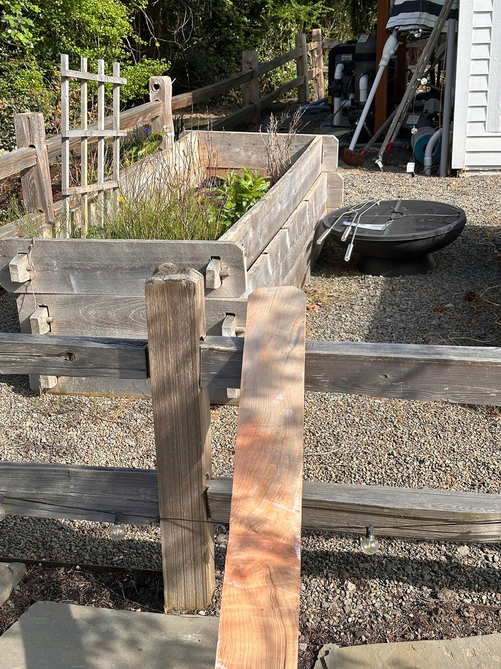
But the bright “orange” of the fresh doug fir fencing was bumming me out, so while I was out of tow,n Ken and Brian came up with the idea to use a slight gray stain to cut the orange and make it look more grayed out. The sample on the left had one coat on the top of the plank, 2 on the bottom.
What came first: The TV or the designer hatred for the TV? Hello friends, and welcome to this week’s installment of Arlyn’s Curmudgeony Design Takedown. Today’s episode? My lack of tolerance for hiding the things in our homes that we need and very regularly use just because they aren’t “aesthetic.” That black remote control? ::Gasp:: The cable modem? MAKE THAT THING INVISIBLE INSIDE A RATTAN BOX STAT! I’m not mad at the desire to have utilitarian things that look nice and surprisingly displayable, but loving design and a beautiful room don’t have to also come with a degree from MacGyver University for how to disguise everything in sight to look like a vintage oil painting or woven basket.
For anyone reading this who is saying, “Arlyn, it’s all about reducing visual clutter,” to that I say: “Yes, I agree, but also, you probably only think that because you read it in an article I wrote a decade ago.” While I get anxiety spikes when things are out of place, cluttered, or untidy, I also prefer my home to work effortlessly without barriers I’ve created for myself in the name of Pretty. Cable management is one thing, but no one should have to sacrifice proper lighting (#TheBigLight) or being able to change the channel because a faux stack of books covering your cable box is blocking the signal.
Who are we doing this all for? Ourselves? Our visitors? We can’t bear to look at a thermostat? A doorbell chime box? Honestly, I think this all hit a fever pitch when images of homes, both by designers and amateurs alike, became a huge part of our everyday vernacular. As someone who has produced hundreds, if not thousands, of luxury home magazine features, I know how much is edited out because cords and light switches are as hated by art directors as they are by designers. This created an aesthetic culture where we all got used to seeing houses without functional things like outlets, and now assume we also need to find a way to Photoshop them out, except in real life. [Side story: I was watching an episode of House Hunters last night, and the featured homebuyer was a woman who made financial empowerment content for social media. She kept saying her home needed to be “aesthetic” and was hyper-focused on white countertops and black hardware because she claims it’s what she needed for her audience to see her as successful. My eyes are only just coming forward from the back of my head.]
Phew! Now that I’ve gotten that off my chest, let’s explore all the “designer disguises” that I find mostly unnecessary, and no one should be pressured into thinking is necessary, either:
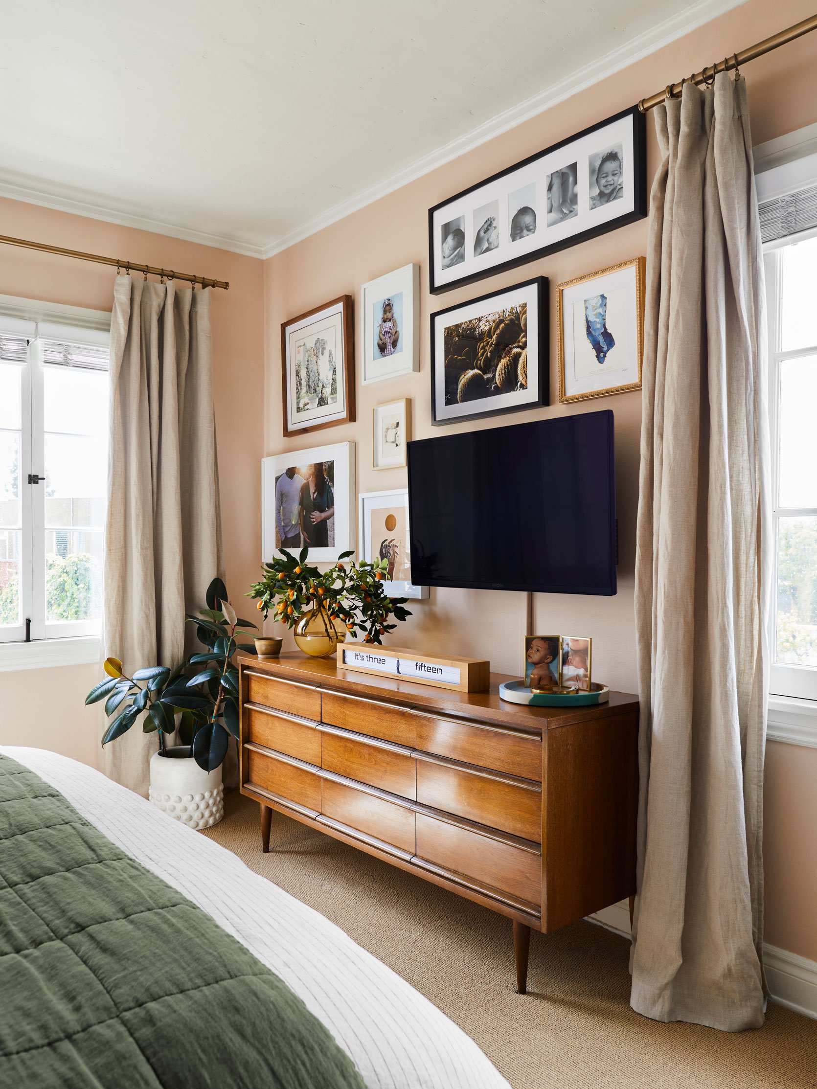
Let’s start with the most polarizing topic: The television. I’ve written on this specific subject in the past and got a ton of opposing feedback. Many agreed with me that a TV is not a thing that needs to be hidden. It’s a part of our lives, and just because it’s a “big black box” doesn’t mean it’s hideous and should be banished. Others brought up some good points about not liking the distraction, and that it’s helpful to put it away behind cabinetry or art or some other concoction when not in use to focus on other things like connecting with loved ones, reading, or conversation. I’ll accept that, because I know that we all have different lifestyles and media tolerances.
But more and more, it just feels like this thing that many of us use daily is some kind of smear on an otherwise beautiful space. Mind you, TVs are smaller and more inconspicuous than ever before. The freestanding furniture-like Sony set that graced my parents’ living room when I was a kid is a far cry from the flat panels of today, and yet we’re obsessed with faking people and ourselves that one simply does not exist in our living rooms.
By far, my most pressing question to all of us here today, whether you’ve thought about hiding your TV or hate the idea, is as follows: Why are we putting so much pressure on ourselves for design/styling perfectionism? I know that our homes are our sanctuaries, and they should make us feel at peace. Visual clutter really can raise our anxiety levels, but are we jumping through performative hoops to make ourselves feel better, or because the Internet slash the design industry, the big “They,” told us we need to hide all these non-decorative things away from the world if we want to be perceived as having good taste, or better yet, chic (the highest podium finish of all the home style qualifies, evidently)?
It should come as no surprise that any accoutrement to the hideous television would also need to be shrouded in secrecy, concealed from our delicate eyes. Does the above basket solution look cleaner and tidier than the open crate with cables popping out of it? Yes, sure. A spaghetti-like knot of cords would inspire anyone to find a solution, but the sheer number of videos on the Internet dedicated to cutting holes in baskets and boxes to preserve a pristine shelfie or mantel is dizzying. As long as there isn’t a mess of long cords spiraling from it, collecting dust bunnies, a cable box, or some remotes even just set in a tray on a shelf or atop a book or two is good enough for me.
Well, I guess this is where I formally introduce myself to you, EHD readers! You’ve seen many photos I’ve taken, you’ve seen my basement, bedroom and living room makeovers that our girl, Emily, has so graciously helped us design, and you may have seen small bits of my face in some of the photos/videos from team retreats—I’m more of a behind-the-camera-gal than in front of it. While I’m not an official EHD employee, it’s been so fun to be a part of this team.

Back in 2021, my family and I made the big move from the Eastside of Portland to the Westside for more space/more yard/slower lifestyle, etc. All the same reasons a lot of young parents move to the ‘burbs. Around that same time, a mutual friend of both Emily and I, Max Humphrey, introduced the two of us. The Hendersons’ rental house (while the farmhouse was being renovated) was in my neighborhood. Because we lived so close, Max thought Emily and I should be friends 🙂 While she’s no longer up the street from me, she’s just a short 7-minute door-to-door drive away. It’s been a pretty great little partnership/friendship these past few years.
Emily has given a little bit of a rundown of our home in previous reveals, but as a refresher, our home was built in 1962, and we are the second owners. The previous owners made a few (somewhat questionable) updates, likely in the 90s/early 2000s. But we still did a pretty large and necessary remodel when we moved in. We pretty much painted everything white to start, and slowly, with the help of Emily, have been adding in more color and character.
Though we made some pretty major changes early on, money and patience ran dry, and we were okay, or more like had to be okay, putting bathrooms on the back burner, knowing very well that someday they would need some serious love.
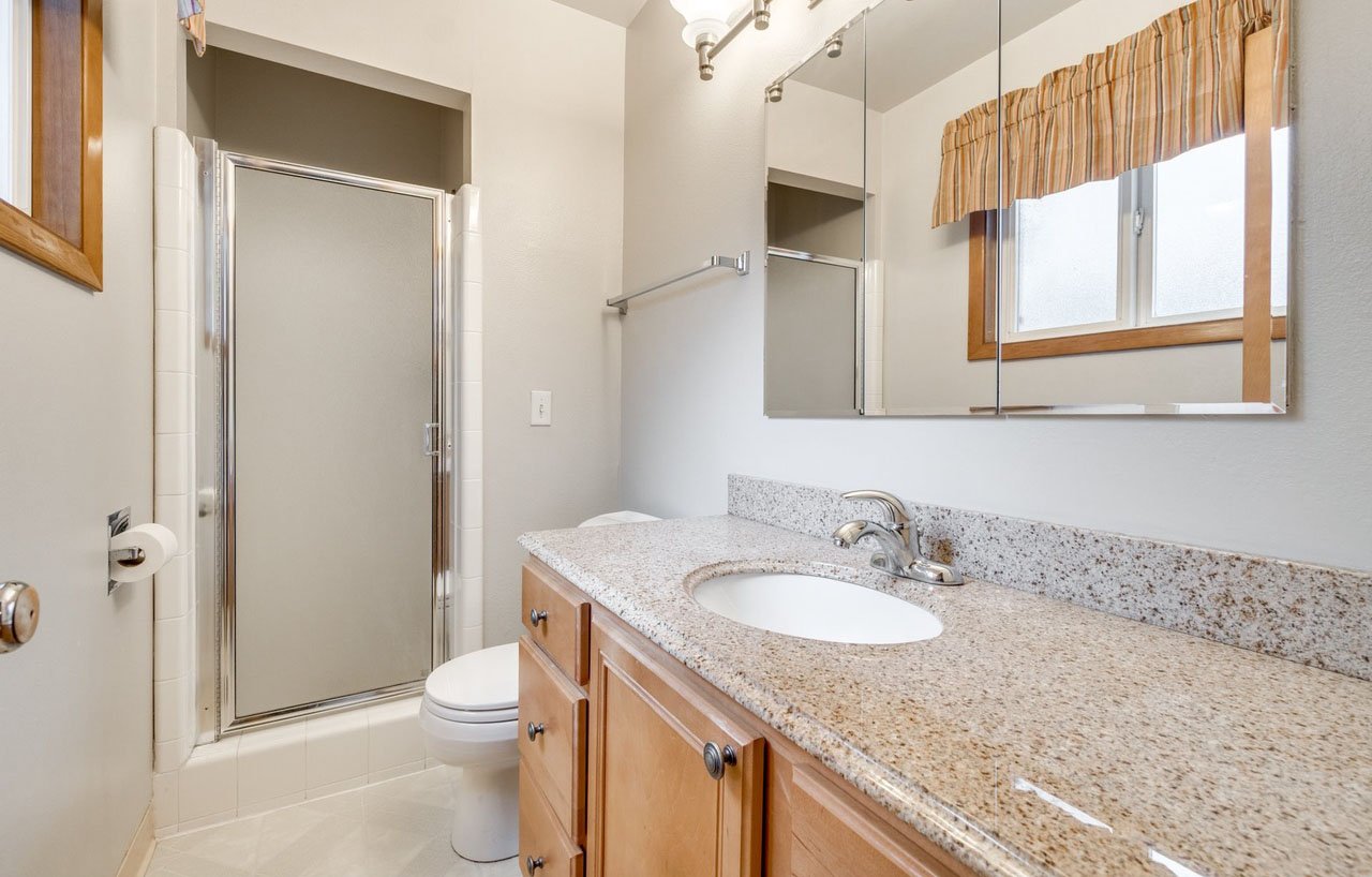
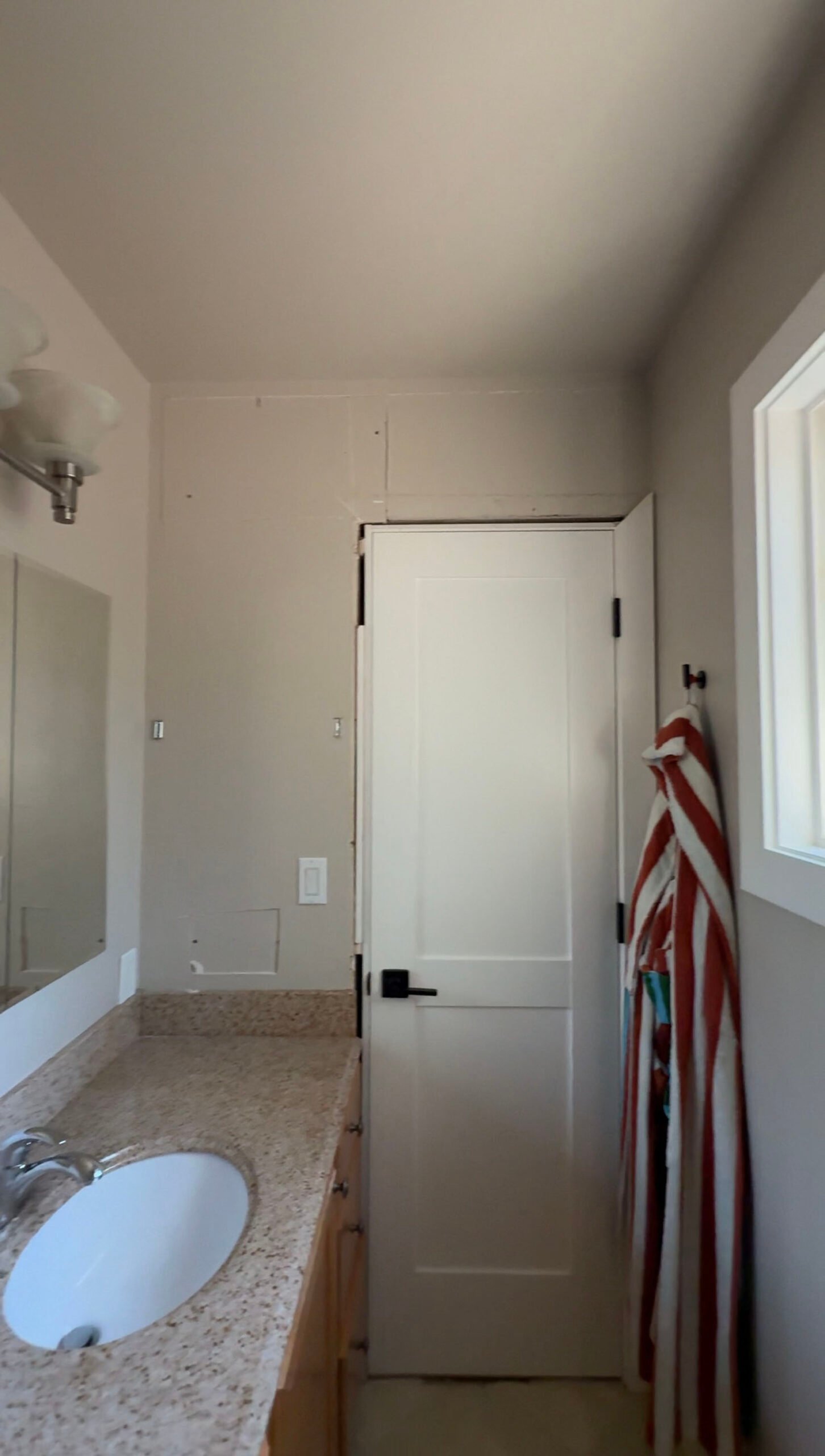
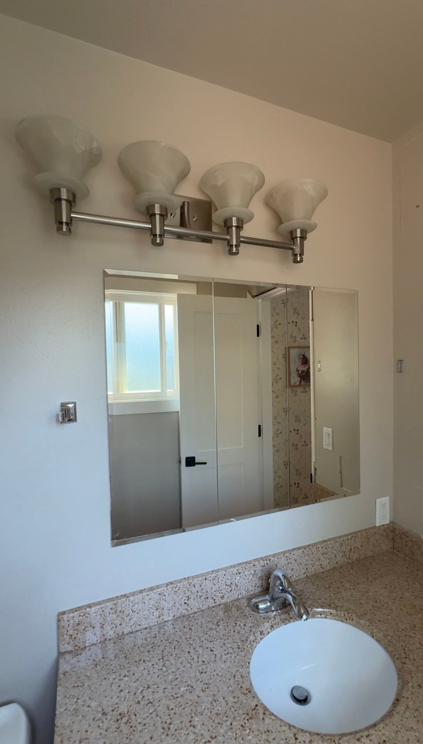
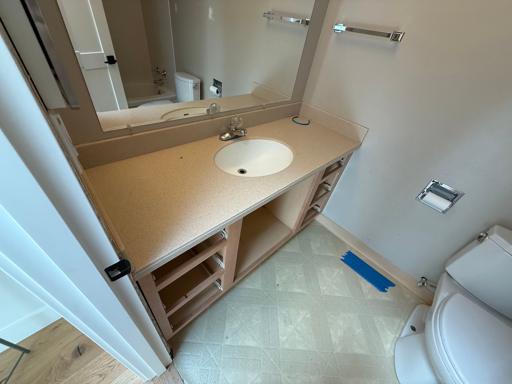
Here’s what the primary bathroom looked like on the day we bought the house. And truly, before our contractors demo’d it a couple of weeks ago, it still looked pretty much exactly like this 4 years later! I had zero desire to do an “in the meantime” quick makeover. I didn’t want to replace hardware, paint the cabinets, hang a new towel bar–I didn’t want to waste a single dollar on bettering this space. (I’m the boring penny-pincher in my family, can you tell?) Honestly, aside from being small, it’s fine. Does the off-center light fixture, shower tile grout that never actually comes clean, and peeling linoleum flooring drive us insane? Of course. But our previous 1905 Eastside home had one small bathroom downstairs and off the kitchen, so an “en suite”, small as it is, felt and still feels very luxurious. I knew that once we saved up, our “someday” remodel would come eventually, so investing any time into this space felt unnecessary.
Here are a few more photos before demo really started:
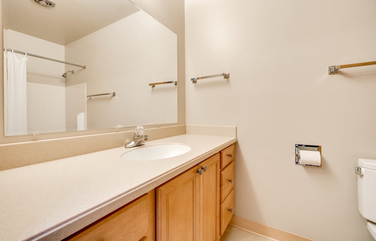
On the other side of our bathroom wall is my daughters’ bathroom–equally hideous and luxurious. I say luxurious, again, because I shared a very small bathroom with my parents and brother growing up, so what a treat it is for my daughters to have their own. This space has also not been touched in 4 years. Between bath times when my girls were little, playing nail salon, and doing the mad morning-dash to get off to school, I’ve actually spent a lot more time in this bathroom than my own. The urge to do a few of those small updates in this bathroom came… and then, eventually, dissipated. In the end, the linoleum is still the linoleum, and the off-center lighting will still be off-center. The time and resources for the small updates just didn’t make sense to me.
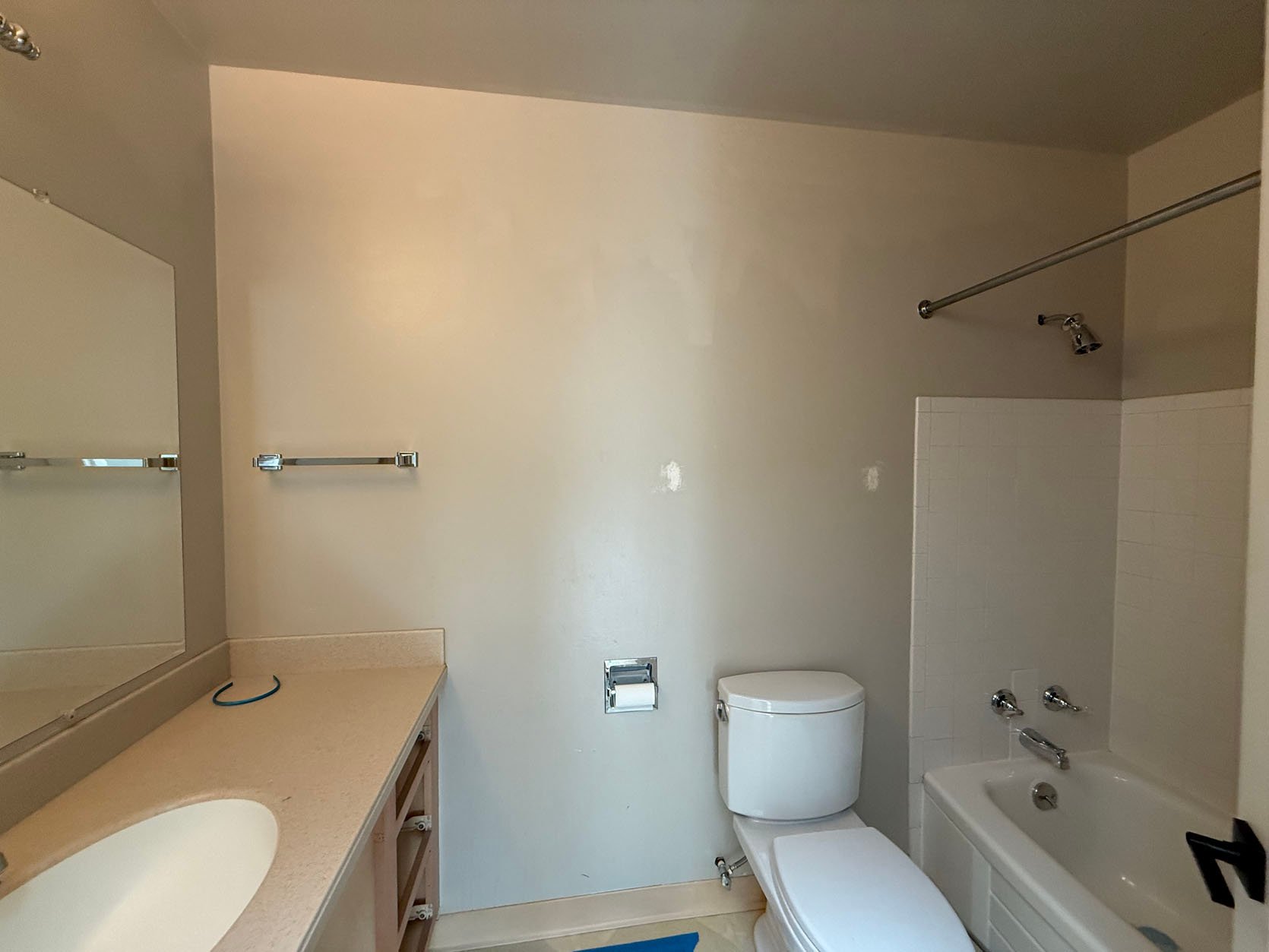
If it’s not super obvious from these photos, these bathrooms are tiny. Because it’s not financially an option to expand the overall footprint, the best we can do is make them more functional and more pretty. In comes Miss Henderson 🙂
AllModern reached out to Emily about a partnership a few months ago, and we all felt like this could be the perfect opportunity to finally do some updating. They have a great selection of bathroom items, from vanities to lighting to plumbing–a bit of a one-stop shop.
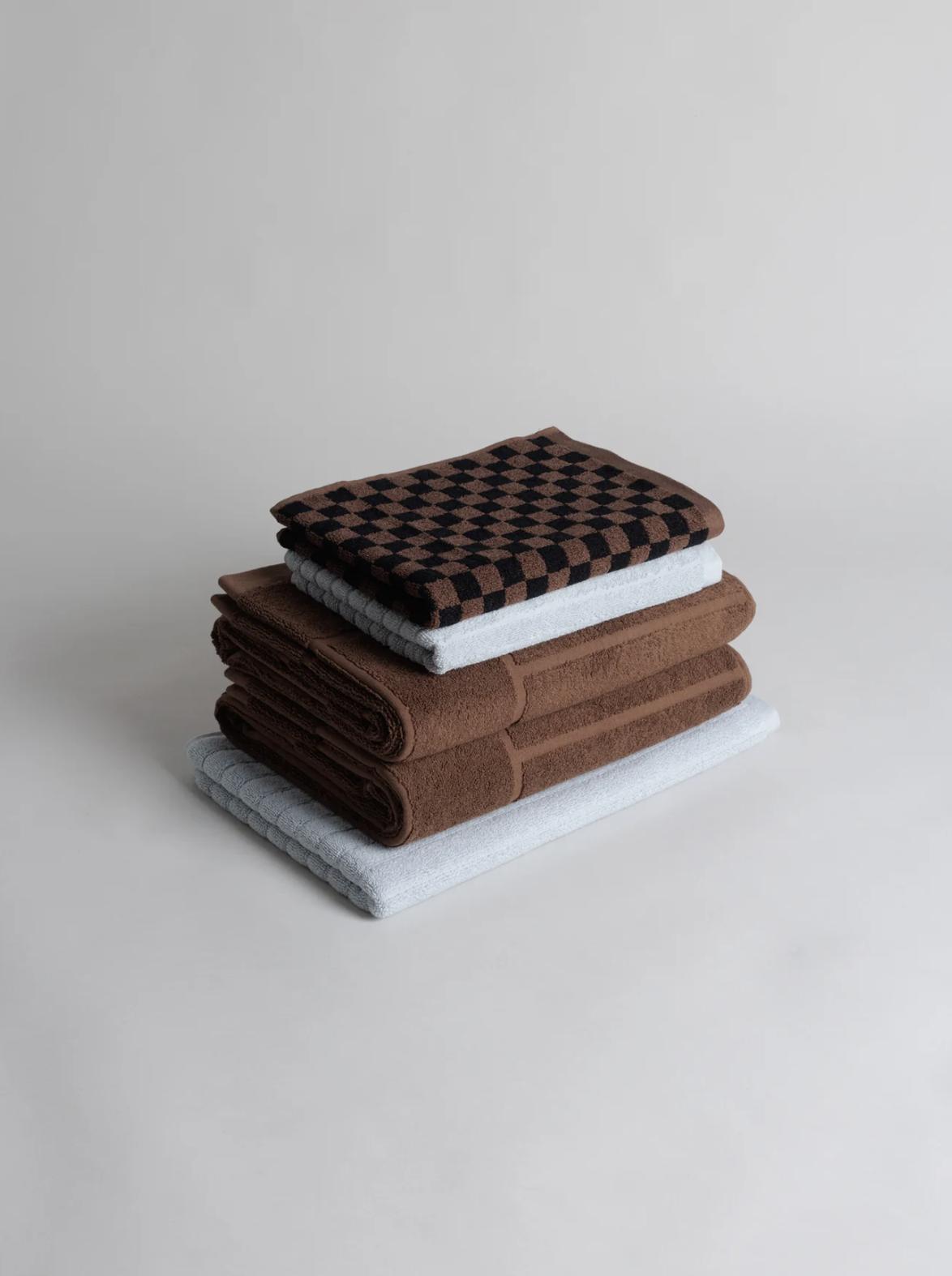
To be very honest with you, bathrooms stump me, design-wise. Everything feels (and is!) SO permanent. I had a hard time really knowing what I even wanted for our primary bathroom. I pulled images of so many amazing pieces from AllModern’s site, but couldn’t get a cohesive design going that felt like us. But then, late one night during a doom scroll, I saw my friend and incredible prop stylist/designer here in Portland, Karie Higgins, posted a photo of a beautiful bathroom with a BAINA towel in it. This led me to BAINA’s website, where I fell in love with the color scheme of one of their stack of towels, and the rest is history.
Once I’d decided on colors I liked, everything else started to fall into place. I found this gorgeous white oak vanity and paired it with this medicine cabinet.
I was also pretty sold on both the floors and the shower being blue square tile. I immediately pulled out all the samples I’d gathered when we redid our fireplace and ordered a bunch more. We eventually landed on this pretty light blue tile that Fireclay generously gifted. We’ll be using 2×2 squares on the floor and 4×4 squares in the shower.
Here’s the moodboard I sent to Emily a couple of months ago. Honestly, I was just hoping she wouldn’t hate it—because by that point, I was completely sold on the whole thing. Good news: she loved it too.
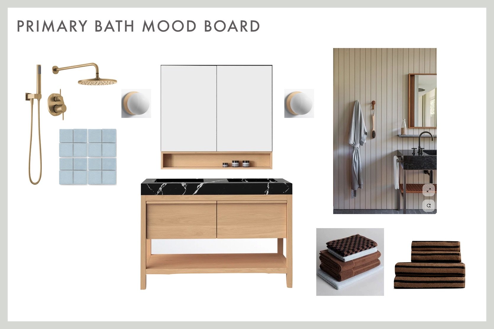
Medicine Cabinet | Vanity | Tile | Checkered Towels | Striped Towels
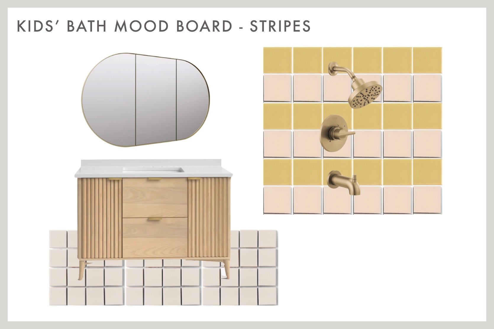
Moving on to the kids’ bath…
Making decisions for their bathroom felt a bit easier than for ours. We knew we didn’t want to go too “little girl” in here. My daughters are almost 5 and 8, so it would be pretty easy to get carried away and design for their ages now. We still wanted it to be fun, but hopefully, a bathroom they’ll enjoy when they’re in their teens, as well.
We found this pretty vanity and paired it with a big built-in mirror/medicine cabinet.
Fireclay was kind enough to gift us tile for both the primary bath and for our girls’ bathroom. We’re going with this gorgeous 2×2 creamy-colored square tile for the floor and will be doing a 4×4 pattern for the bathtub walls in this fun, warm yellow and pale pink. While the tile was ordered with the intention of doing a checkered pattern, we know I love checkered, I am wondering if a stripe would be pretty instead?
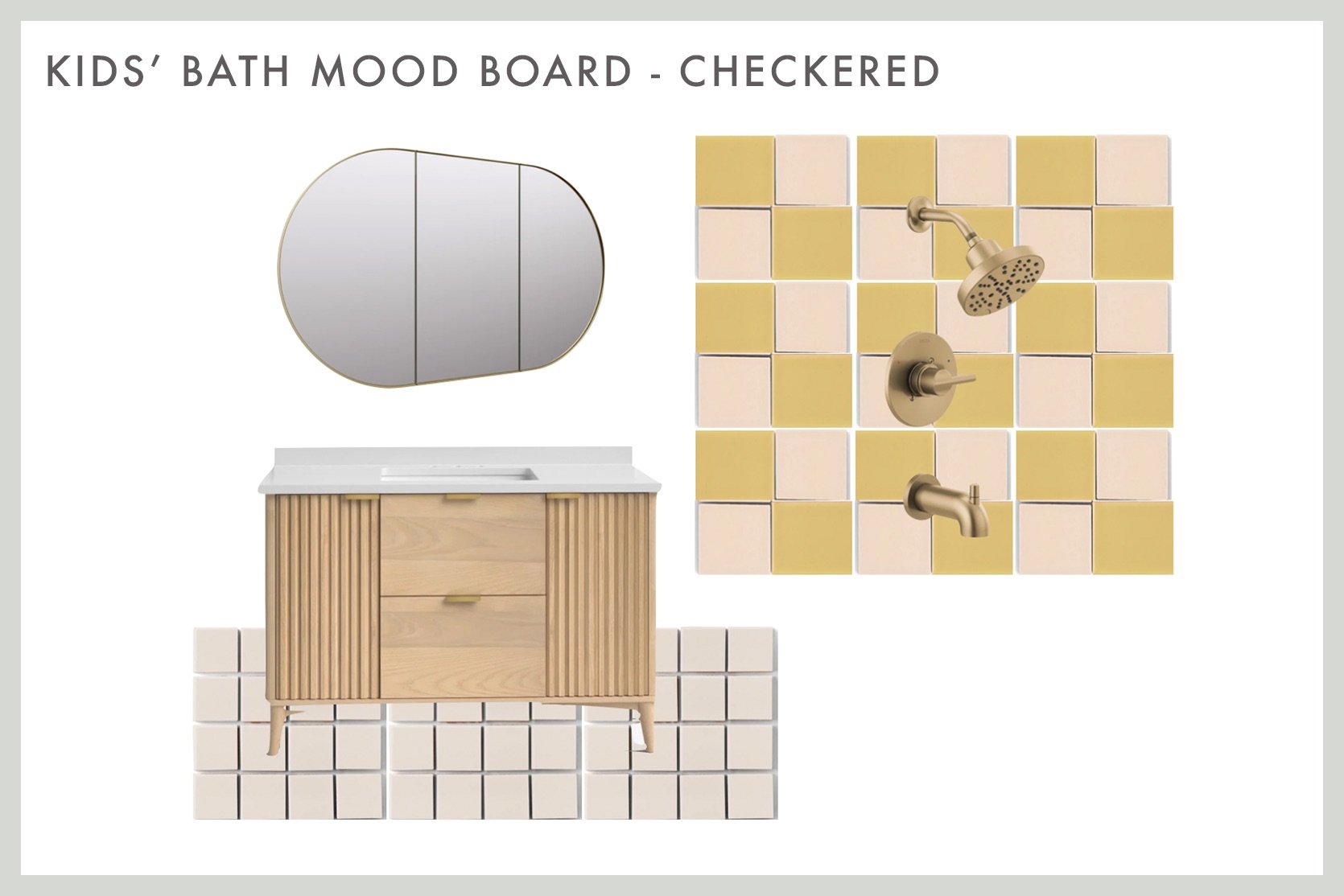
Medicine Cabinet | Vanity | Wall Tile (yellow and pink) | Floor Tile
Happy Sunday, everyone. What feels like the end of summer is upon us, which always catches us a little off guard. With that said, we’ll be running into every swimmable body of water at least until Labor Day to soak up every last second. Does anyone have any last-minute fun summer plans?
This week’s house tour is “the epitome of Spanish architecture during Hollywood’s Golden Age” and was thoughtfully restored by Alexander Design. It’s the dreamiest California organic, MCM style, and you have to go see all of the details, especially the living room’s ceiling!
From Emily: This sweater felt like my gateway fall piece – chunky, layerable, classic, cropped with good details. And that cuff – she’s goooooood. It feels so high-quality and well-made. It took me a while to get into Abercrombie, but once I tried things on, I realized that many pieces are, in fact, for me.
From Caitlin: I’ve been on the hunt for some vintage or handmade kitchen ceramics – spice jars, cruets, all that jazz – and I stumbled upon the CUTEST sugar jar I’ve ever laid eyes on. (You can go peek. I’ll wait.) ISN’T THAT THE MOST DARLING LITTLE THING YOU’VE EVER SEEN? The houses! The trees! The scallops! The finishing! MY HEART IS EXPLODING. Don’t even get me started on the pitcher, the pour-over coffee maker, or the Christmas mug. There’s something so endearing about these sweet pieces, you know? You can tell that human hands made them with love – they’re just too freakin’ cute. (PS. If you throw one of them in your cart for a few days, you’ll likely score a 30% off coupon code. It worked for me!)
From Jess: I know this top won’t be for everyone (and the sizing is less than inclusive, UGH), but it’s the only thing I’ve bought in the past couple of weeks, and I’m in love. This sheer mesh tank top is going to joyfully take me through the rest of this VERY hot weather (aka until November). With my black bralette, I can totally dress this up or down, oh, and it’s reversible! So I can choose between a high neck and a scoop. I got the graphite color because I wanted a softer tone. I found this brand through Instagram, I think, and haven’t tried anything else, but I’m definitely interested.
From Mallory: I finished my 1 month living room makeover (photos are being edited and everything is coming to you VERY soon) and initially I had planned to put up a gallery wall over the sofa but we started putting it up and realized we hated it…so 1 week prior to shooting I had to find something huge to go above the sofa that wasn’t 10 thousand bucks. WELL, I COULDN’T BELIEVE IT BUT I FOUND THE PERFECT THING. It’s this absolutely gorgeous tapestry from the coolest Etsy shop based in Australia (shoutout to the seller and dhl express international shipping because she made this thing show up in 3 days for only $40, which saved my living room shoot). Huge art is so hard to find, and I felt like this pricing was reasonable considering it comes with mounting hardware and takes up SO much space. Bye bye blank walls!! If you’re looking for a large tapestry for a fairly reasonable price in comparison to other tapestries and art this size, check this Etsy shop out!
From Arlyn: I’ve got a not-very-sexy but super useful product for you today: washing machine cleaner tablets. We don’t have a front loader, but our top loader still gets so musty and mildewy smelling. I often run vinegar or bleach cycles to try to squash that, but I find these Affresh pods work best. You just throw one in, run a hot water/heavy cleaning cycle, and boom, much cleaner and better-smelling machine. They also make these for garbage disposals and dishwashers.
From Marlee: The dreamiest summer scent! I picked up this perfume from a cute little shop last winter and recently rediscovered it after it got lost in one of my bajillion bags for months. This is like if vanilla went frolicking through the woods and then stumbled upon a magical beach at sunset…You know? Not only is the smell gorgeous, so is the packaging – it’s one of those items that I where every time I use it, it feels like the first time I took it out of its packaging. It never loses its novelty! It’s totally gender-neutral, not too sweet, not artificial-smelling, and I get so many compliments on it.
Also From Marlee: Okay, maybe this is common knowledge, but I was recently put on to this stain remover bar that has absolutely changed my life. AND for less than $3! Huh?!? (Look for it at your local Ace!) Get an old toothbrush wet and scrub it on the bar, then scrub it into literally any stain – it even helped with an oil stain that had been on a sweatshirt for years (it didn’t go away completely, but much less noticeable)! This thing has made me become absolutely insufferable at Goodwill – the opportunities are endless when you know you can get that stain out at home…
From Gretchen: I’ve shared it before, and I’m more than happy to share it again…my Fenty Match Stix Contour Skinstick is the hardest-working item in my makeup kit. I don’t know what magic Rihanna put into this formula, but I know better than to question it. It is just so creamy, buildable, and blendable that it’s basically impossible to get wrong. I use this more as a bronzer, less of a “contour,” but slapping it on is just so quick and easy. I scribble some on my cheekbones, draw a couple of lines near my hairline, and hit each side of my nose with the lightest touch, before blending it all out with a big, fluffy brush. The color, Mocha, is perfection for me. The product sort of melts into my face, making my skin look so naturally tan and glowy. I’ve repurchased this Skinstick a solid three times because I can’t be without it, but trust me when I say it lasts me months and months. Ulta is doing a promotion through 8/23 with Fenty products; Spend $50 and get a free makeup bag. While I’d say grabbing two of these sticks to secure the gift bag would not be a mistake, I can also HIGHLY recommend the Fenty Cream Blush in Rosé Latte. Another super creamy, perfectly pigmented product that blends so well and gives your cheeks that perfect rosy tone.
Before you leave us today, we wanted to turn the attention to our friend Mark Weinberg. He was our incredible photographer on both of our Rugs USA shoots, and we couldn’t have asked for a more talented and kind person to work with. We just found out that he was diagnosed with a brain tumor. There is a GoFundMe to help pay for the surgery and recovery if you have any ability to donate. Thank you so much<3
Thanks for spending a little time with us today, and see you tomorrow. xx
Opening Image Credits: Styled by Getteline Rene | Photo by Mark Weinberg | From: It’s Here! Our First EHD Collection With Rugs USA (+ Why Now? And Why This?)
